We’ve been speaking to Campbell Brown, CEO and Co-Founder of New Zealand startup PredictHQ. PredictHQ is a global events intelligence platform that aggregates, enriches and connects scheduled and real-time event data happening both locally and globally, then predicts which ones could impact your business. Here’s what Campbell had to say about how PredictHQ have used data to inform their development.

Where and how do you display and share your dashboard to encourage the team to view and act on the data?
Everybody in the team has access to our dashboard within the business web browser. I’m also looking at getting a TV screen up on the wall to create a sharing loop of our two main dashboards. In the meantime, while our team is small, we all have three computer screens each so the dashboard is always on display. We have a company ethos around autonomous thinking and behavior. In fact, it’s the most important quality I look for when hiring.
We hope to build a transparent culture where the monitoring of our business health is democratized and so becomes everybody’s responsibility. Everyone here believes in the vision and the duty they have. People are also much more motivated when they can see on the dashboard how their hard work actually pays dividends.
How did you choose the KPIs to include on your dashboards?
The team is almost always distributed across several countries so we needed to create visibility of our high-level data. I also wanted to make sure the team was focused by not having too many different metrics diluting their attention. With that in mind, and as part of our current focus on nurturing customers during Beta, we created a Customer Overview dashboard that’s all about having visibility of the customer’s actions and taking care of them.
Engagement is a key indicator of business health for a Software as a Service (SaaS) company, so I want to know who’s on our site in real time, what they’re doing on our site, how many visits we’ve got across our website, our app, our blog and our customer support, how many active users we’ve got today, the past seven days, the last 30 days, how quick our response rate is and if there are any outstanding tickets. This all helps us understand if and where we need to dig deeper. What I'm not using Geckoboard for is going down to that granular level. When I want a granular view, I jump into the individual tools we use.
We’ve also built a Performance Advertising dashboard to help us ensure we’re getting the most out of the budget. It’s always more motivating to see holistically what I’m getting for my money than just checking how much I spent in individual performance advertising accounts like Google Adwords.
What I want to see is how many conversions we've got, what the average cost per click is, what the cost per acquisition and conversion rates are, which are some of the most important metrics for me. That way, I can quickly understand which channel is actually worth us putting a bit more effort into it. Receiving this information in a seamless fashion is really critical to us operating on a day-to-day basis.
How did you decide the layout for your dashboard?
I didn’t want the team to be met with a wall of numbers so I broke up the data on our Customer Overview dashboard into a few different types of visualizations – it’s got a lot of real-time dials but also goals. For instance, for the number of subscribers that we have, we have a certain goal that we want to hit within a certain time and having that little ‘what percentage you are to achieving that’ is really motivating.
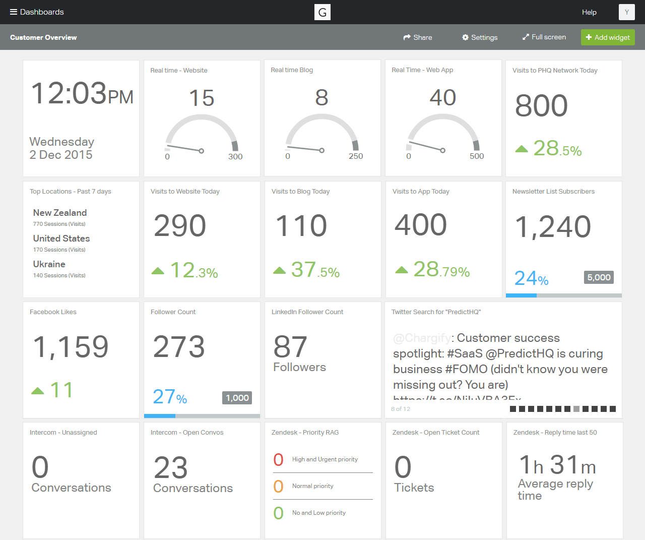
This dashboard contains sample data.
Wherever I can, I will also combine numbers with graphics to break things up visually. Then I iterate. I review our dashboards about once a month and make any necessary changes.
The core thing with dashboarding is, it's a process! The dashboard that you begin with doesn’t necessarily have to stay the same. As you start understanding your business and what the most meaningful metrics are, you begin to adapt what you need to quickly consume visually. With only so many hours in a day, this will always be a balance between too much or too little information in order to keep things focussed.
Any other pro tips on how to use dashboards to nurture a data-driven culture?
Getting the kind of visibility across the business that a dashboard offers is very important within our tight-knit team. For instance, our software engineers can see tangible results of their work and how it impacts the business. When team members can easily see their hard work come to fruition in real-time, it helps to build on the vision of the business and encourages people to think about how they can further improve or innovate.
Liked this article? Try these next:
3 must-read blog posts on choosing your KPIs