We’ve been interviewing Ryan Procter, who is Digital Communications Officer at Tech City UK.
Tech City UK is a publicly funded organisation with a private sector mentality. Their goal is to accelerate the growth of digital businesses across the UK and do this by building programmes to help entrepreneurs and businesses at different stages of their evolution; convening policy makers with digital entrepreneurs to create the optimum policy environment for digital businesses in the UK; and promoting the UK's digital economy regionally, nationally and internationally.

Where and how do you display and share your dashboard to encourage the team to view and act on the data?
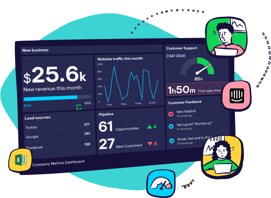
We display our Geckoboard on a large screen in the Tech City UK office to monitor the effectiveness of our programmes and communications.
It's a great way of maintaining a constant focus on the optimisation of our core business and marketing KPIs. It also allows us to showcase to the wider TCUK team and visitors to our office the impact that initiatives like Digital Business Academy - our set of free online courses to help people start, grow or join a digital business - is having.
How did you choose the KPIs to include on your dashboard?
All KPIs are selected on the needs of each individual programme and the vision of each programme head. This can be related to acquisition and retention, eyeballs on the brand, number of people reached and value unlocked. It's also a fluctuating principle depending on how the product develops and the market proposition evolves.
For Digital Business Academy for example, we track sign ups, course completions, people currently completing courses and the amount of rewards applied for following course completion.
We also track a range of marketing KPIs associated with the Tech City UK website and brand including our website traffic, visitor demographics, and our top sources of traffic.
How did you decide the layout of your dashboard?
Our dashboard layout is determined by the intricacy of each metric being tracked. For Digital Business Acacemy the top level shows things such as social media followers, newsletter subscribers and top blog posts.
Towards the lower section of the board we have more granular metrics such as users on each Digital Business Academy course in real time as well as custom-made goal tracking tables.
Arranging the dashboard in this manner allows us to work from the bottom upwards to achieve our targets at the top!
Any other tips on how you can use the dashboard to drive a data-driven culture?
Geckoboard's simple yet granular nature allows every team member across the organisation to be aware of our overarching digital performance.
If we’re seeing a screen with lots of red arrows, we know we need to work together as one team to rectify the problem and change them to green!
Liked this article? Try these next:
Customer interview: 383 share their best practices to build a data-driven culture