Dashboard examples from companies like yours
Browse over 70 dashboard examples based on real business dashboards
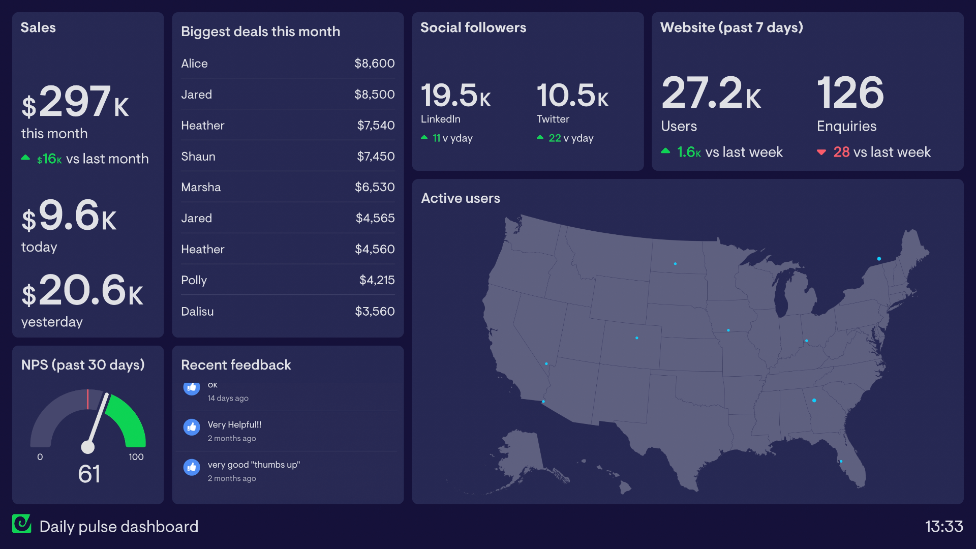
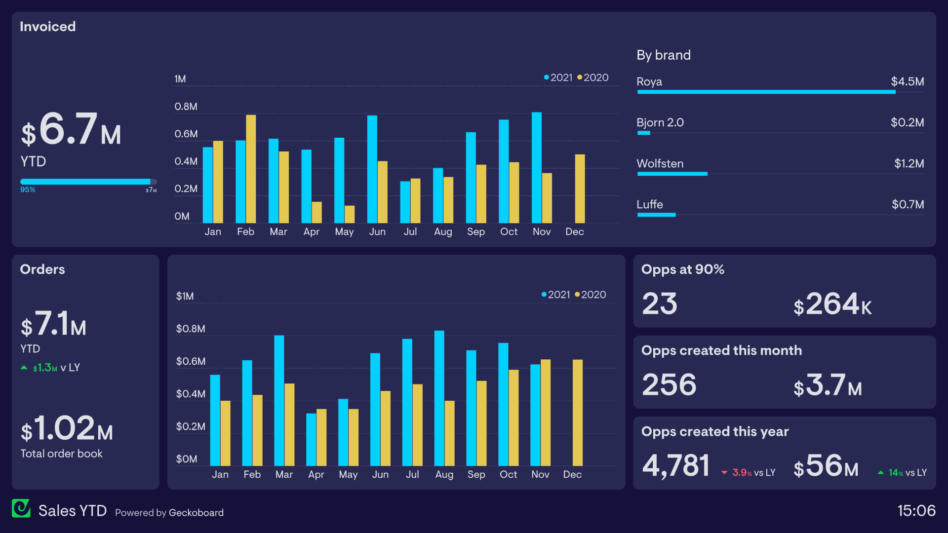
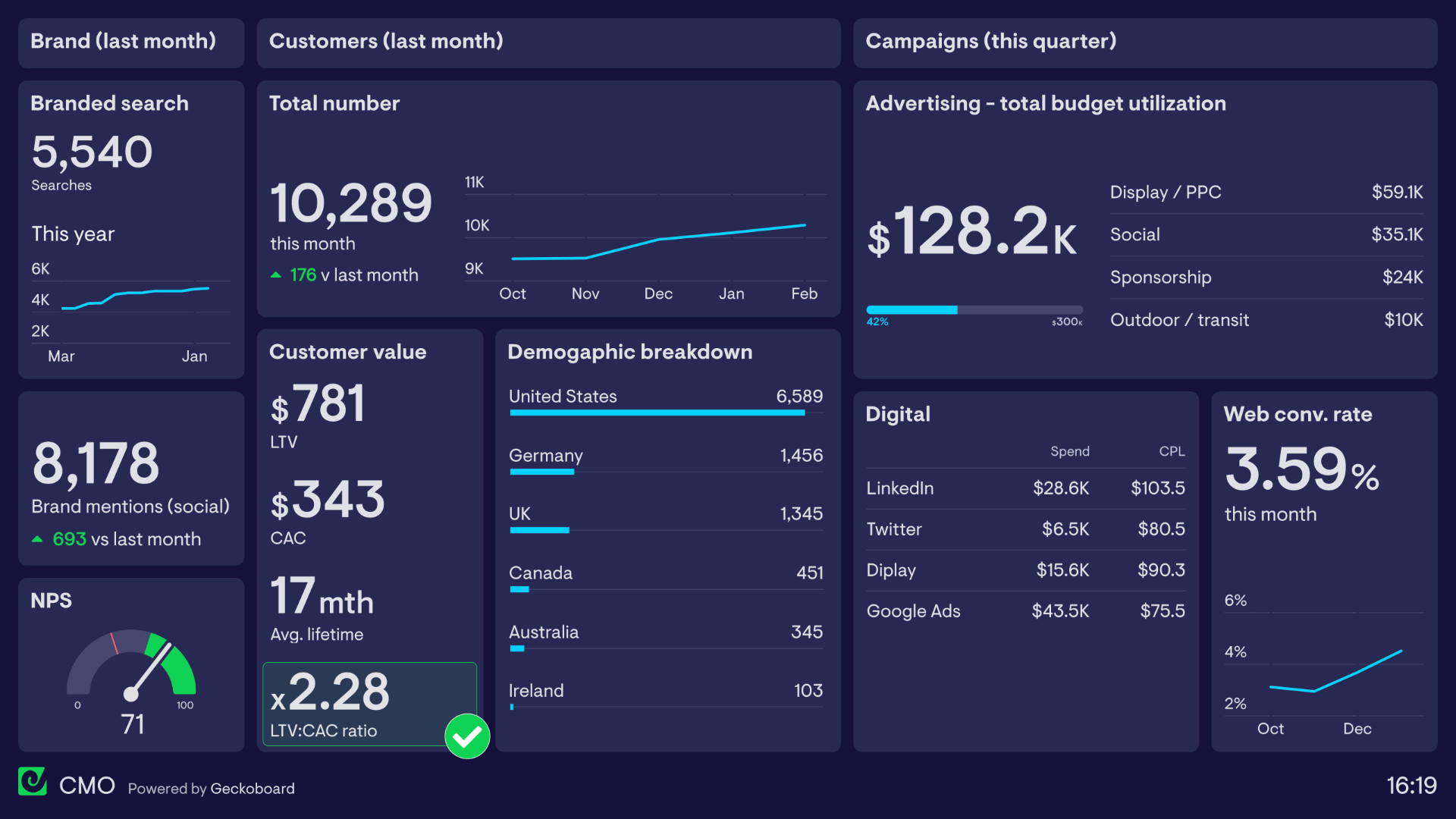
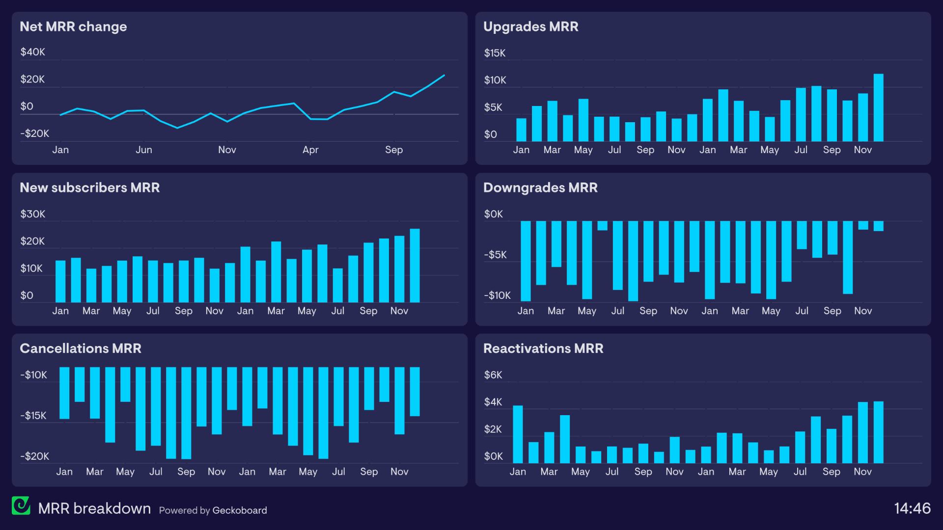
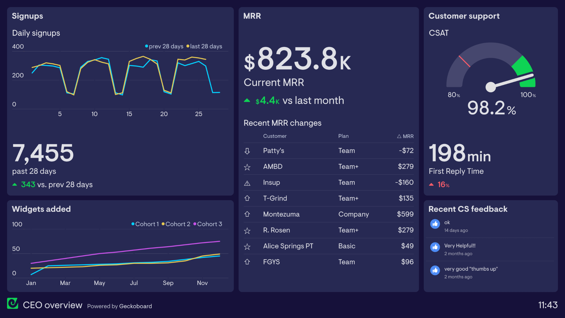
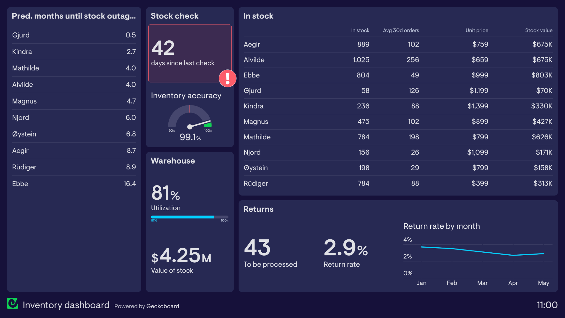
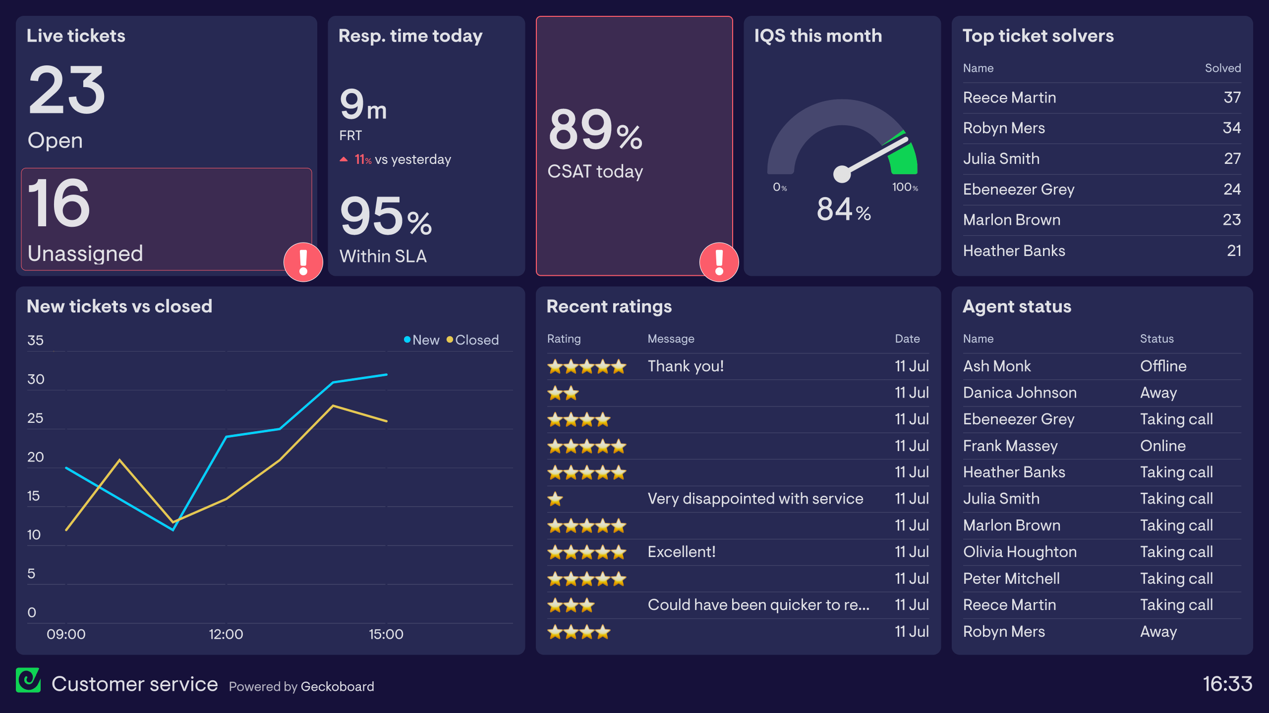
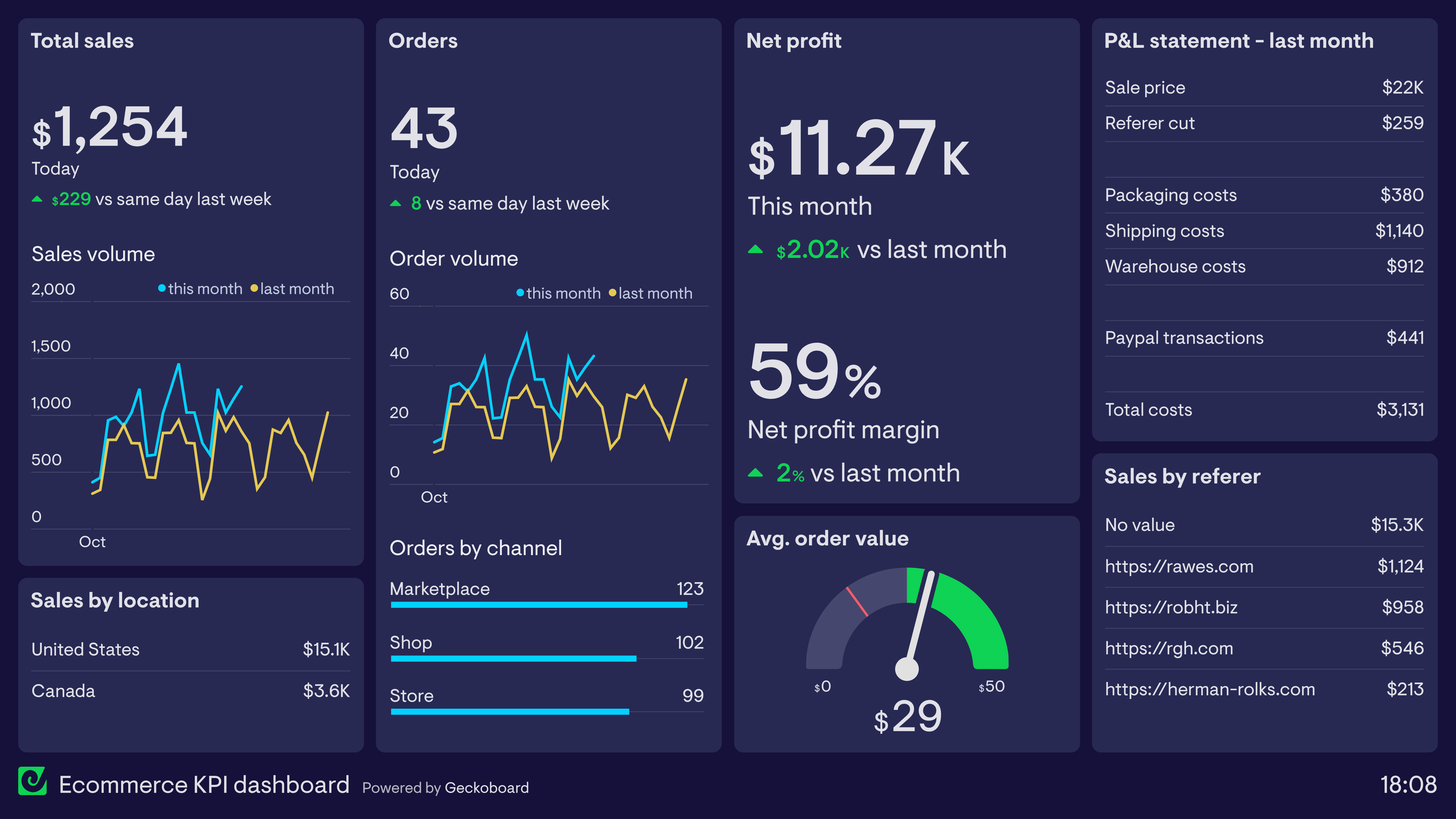
KPI dashboards surface the metrics that matter, helping you to make better, faster business decisions.
Take a look at our library of dashboard examples. Based on dashboards used by real teams in Marketing, Sales, Finance, Support, Operations and more.
Or try Geckoboard for free today and build your first business dashboard in minutes.