Zendesk recently launched its brand-new Dashboard Builder, and there’s plenty to get excited about. To help you get the most out of it, we asked Zendesk Expert Jude Kriwald to break it all down. In this post, he covers what’s changed, what’s improved, where there might be challenges, and how to successfully migrate your existing dashboards.
Zendesk recently launched a new Dashboard Builder in Explore. This is an announcement that shouldn’t be overlooked as they’re planning to sunset the current (legacy) Dashboard Builder in Q4 2025.
Major product changes like this always ruffle a few feathers.
In this post, we’ll cover some of the key features that are changing, how to work around some of the less-than-ideal knock-on effects, as well as clarifying what isn’t changing. There’s a lot of confusion in the air…
We’re going to clear a few things up!
Dashboard Builder / Report Builder – what’s the difference?
First, the new Dashboard Builder is not to be confused with the new Report Builder, announced in April 2023.
The Report Builder is where you combine metrics and attributes to build individual reports, such as tables, bar or line charts. The Dashboard Builder, on the other hand, is used to display multiple reports that are grouped by use case or category, along with filters which can update the data for all the reports on that given dashboard.
The new Report Builder is still missing some absolutely fundamental features, such as custom metrics and there are no current plans to sunset the legacy Report Builder.
We can continue to create reports just as before, using the legacy report builder. The creation and editing of reports is unaffected by the new Dashboard builder; using it does not require the use of the new Report builder.
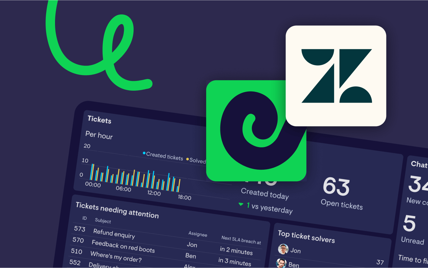
How does Geckoboard fit into the picture? As an external tool, it works differently, there’s no distinction between reports and dashboards.
Geckoboard is one of Zendesk’s most popular integrations, it complements what you can do in Zendesk and takes it a step further:
- Spin up real-time dashboards in minutes – Geckoboard customers often highlight how quick and easy it is to build dashboards.
- Access live data, regardless of your Zendesk plan. Your metrics update based on the Zendesk tools you use, not your plan:
- Zendesk Support: every 10 minutes
- Zendesk Chat: every minute
- Zendesk Talk: every 30 seconds
- Zendesk Agent Status: every 30 seconds
- Bring data together from multiple sources – Connect other tools like Aircall, Intercom, Shopify, and 90+ more to centralize all your customer service metrics in one place.
- Easily share insights with your team – Share dashboards on TV screens, via Slack, email, direct links, mobile, or embed them in other tools.
A guide to migrating dashboards
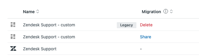
Migrating existing dashboards to the new platform is easy. Simply head to the dashboard page and hit “Start migration”.
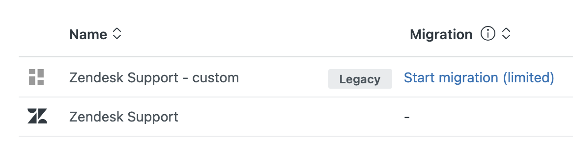
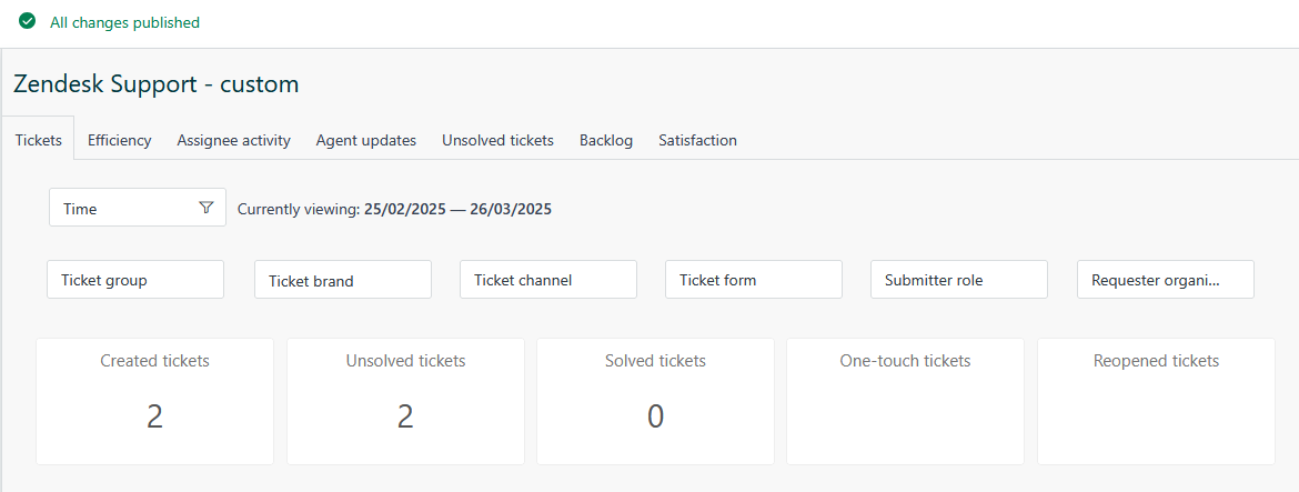
Default Zendesk dashboards (such as “Zendesk Support” in the screenshot above), cannot yet be migrated. However there is a workaround; clone it and then migrate the clone!
You’ll note in the example images that Zendesk only offers us a limited migration for this dashboard, meaning not all features can be migrated. Clicking this button reveals which features will be missing.
Note the option to share the dash with the same people, which is recommended in most cases.
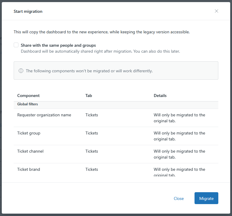
Although it may look like a long list of incompatible features, most dashboards look virtually identical once created. That doesn’t mean they function at all the same.
To illustrate that point, here’s an example of what the default Support dashboard looks like in the Legacy format:
And here it is, converted to the new format:
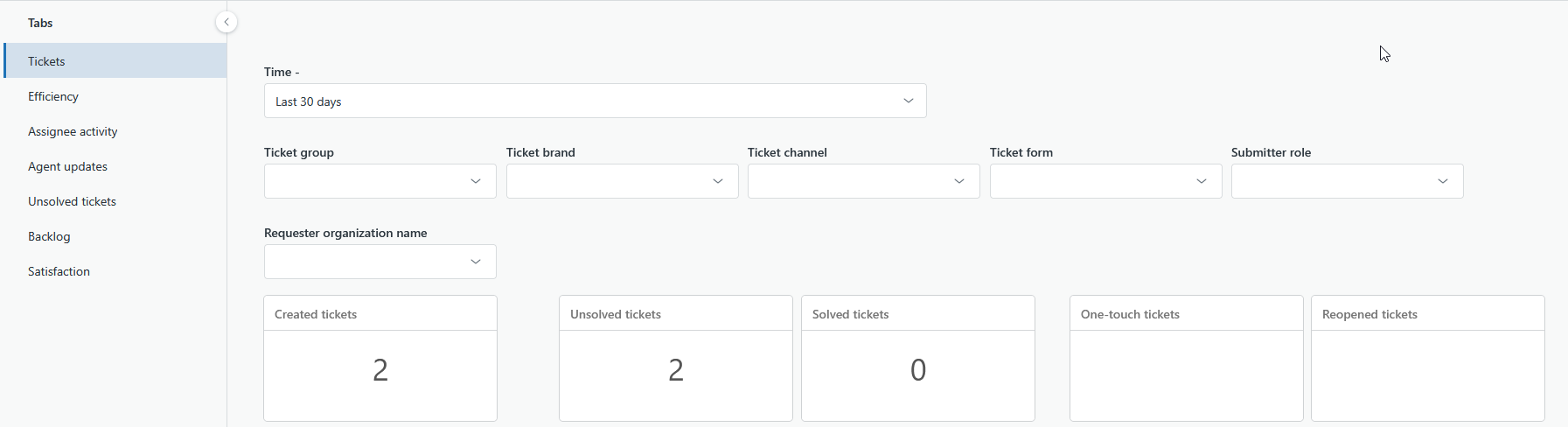
You can see there are very few differences visually, and despite the warnings such as Ticket Group and Ticket Brand won’t be carried over, yet they appear to migrate fine.
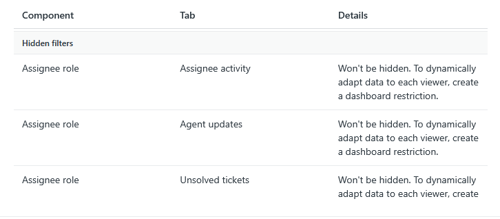
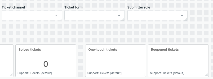
However some elements do not migrate so well. For example hidden elements are no longer supported in the new Dashboard Builder.
We can see that the Assignee role is indeed unhidden. This filter is normally bookmarked (pre-set) to filter only for agent or admin activity.
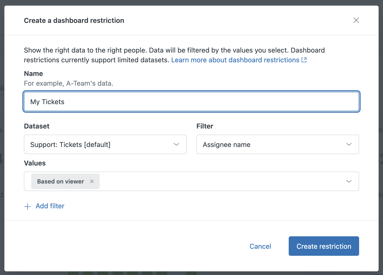
Data restrictions
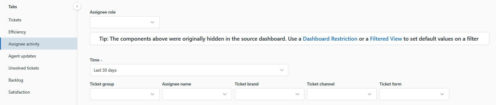
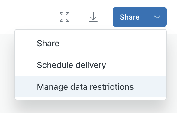
This can be fixed using the new Dashboard Restriction feature to only show data where the Assignee Role is Admin or Agent. The feature is hidden away. Head to the arrow in the blue Share button > Manage data restrictions.
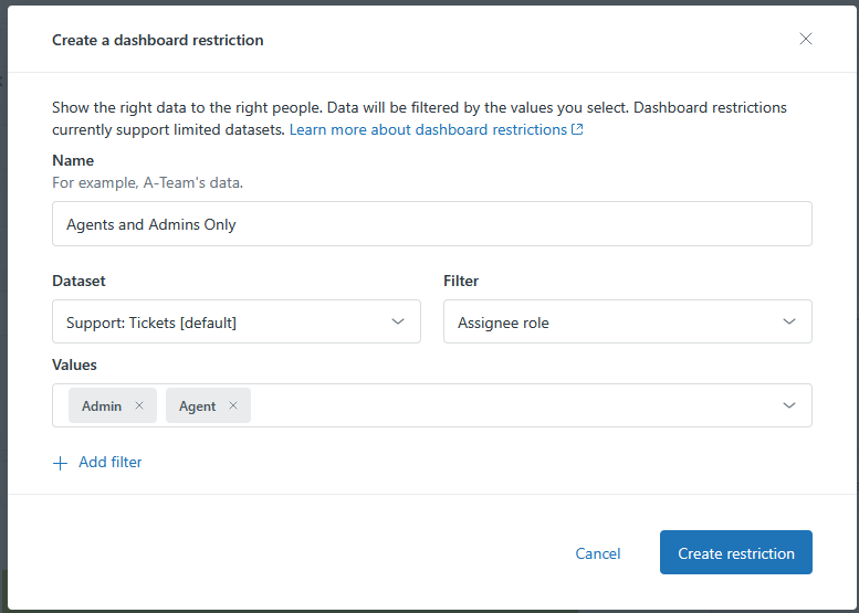
This works well for filters that will rarely change. The downside, along with Filtered Views, which we’ll cover below, is that there are now three different ways of filtering a dashboard (normal filters, Dashboard Restrictions and Filtered Views), whereas before all filtering was achieved by… filters!
Filtered Views
As mentioned, there is a third option to handle the removal of hidden fields: using Filtered Views. On the surface, this is a great improvement on its predecessor, hidden bookmarks.
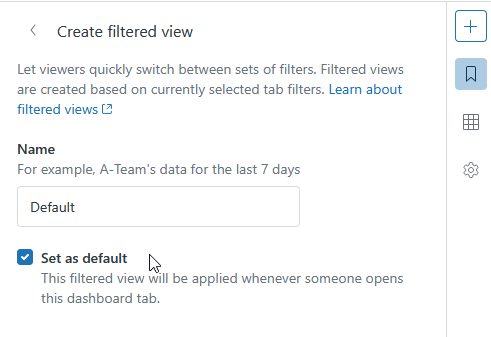
This is pretty much a like-for-like replacement for the bookmark feature, except it’s easier to use. You set your filters first, then save that as a Filtered View.
The huge downside to using a Filtered View, however, is that, as you have to set the filters first, you must use visible filters (hidden filters are gone in the new Builder). This means that these filters will always be visible, even for an unwavering filter such as setting the assignee role to agent and admin.
Given that filters are typically used for variables that we want to, well, vary, it’s frustrating that utilising a Filtered View requires these never-changing filters to always be visible next to those that will be varied. This will lead to confusion among occasional readers of our data for whom it’ll need to be made clear which filters they should play around with and which should not be touched.
Whilst it makes sense to move away from an over-reliance on hidden filters (which were cumbersome to set up), the new solution does require a bit of a learning curve.
Key tips
- Use Dashboard Restrictions for filtering requirements that will never change (such as setting the Assignee Role to Agent and Admin)
- Use Filtered Views when there are more than one collection of filter combinations you want your users to be able to easily switch between, such as custom ticket field combinations or jumping between time periods specific to your organisation.
Now, back to the practical steps of migrating!
Finishing your migration
Go ahead and click Migrate.
Once the migration is complete, you’ll notice that the legacy dashboard’s value under “Migration” has changed from “Migrate” (as you’ve just migrated it) to “Delete”.
If you want to migrate a default Zendesk dashboard, such as the Zendesk Support one above, you simply need to clone it, then migrate that clone.
In my testing, dashboards replicated and migrated like this produce identical data, when viewed side by side.
More key changes
Background
Visually, the dashboards remain largely unchanged, except for a rather distracting new default background visible whilst editing the dashboard.
Unfortunately, there isn’t currently a solution to this. In the old builder, we could have at least put a white rectangle behind our working space! Not a big deal, but enough for people to rightly moan about!
My understanding is that these squares are there as the new Dashboard Builder puts a great emphasis on snapping your reports and filters to this grid. That may produce neater outputs, but it makes working on dashboards an eyesore.
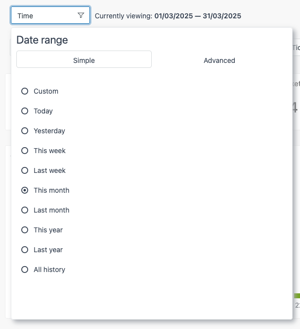
Time filters
Time filters are one of the most clicked-upon elements in any Explore report, so it’s worth noting how they’ve changed.
In the legacy builder, they looked something like this, with two tabs for Simple and Advanced time ranges:
In the new builder, they’re not so different, but might take some getting used to:
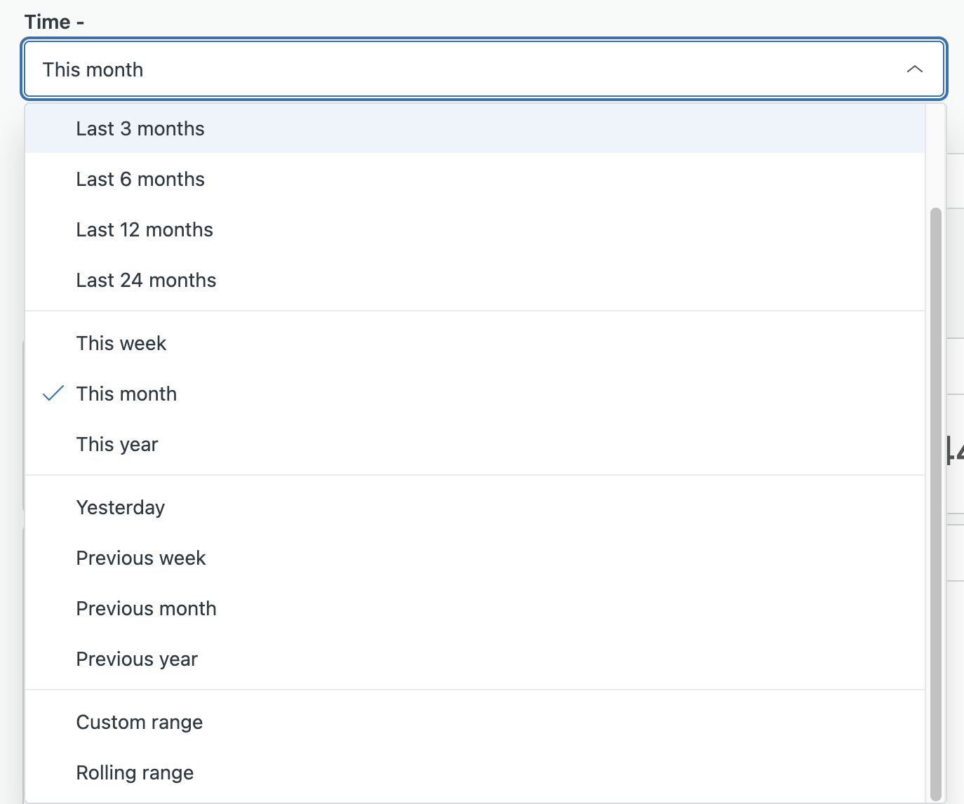
Gone are the tabs. Instead, we have a list of simple options, with our custom option at the bottom, alongside Rolling range. Rolling Range may be a new name, but it’s no different to the functionality available to us in the legacy builder under the Advanced tab.
This shift in UI simplifies things and nestles advanced options away but keeps them clearly labelled.
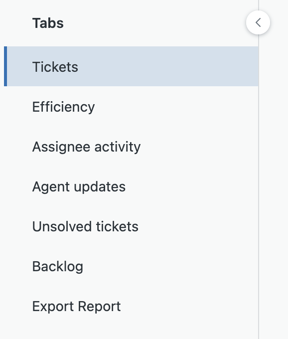
Tabs
There are some other obvious differences, such as the tabs being listed in a sidebar instead of along the top, more like pages or chapters.
Exporting reports from dashboards
In the legacy Dashboard Builder, you could hover over any report and easily export it as a CSV, image or PDF.
Unfortunately, that feature is no longer available in the new Dashboard builder.
Instead, we are only offered this option at the top of each tab.
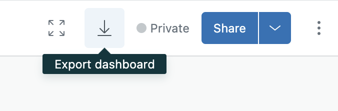
Confusingly, whilst the tooltip says “Export dashboard”, this button actually only exports the tab. It does this by compressing all of the reports on that tab into a ZIP file.
This is cumbersome as it means not only extracting the archive, but also then looking for the correct CSV file name for your report.
As a far-from-perfect workaround, if there’s a report that you regularly need to download, it’s recommended to put it on a tab of its own.
Whilst this doesn’t prevent Explore downloading the report as a ZIP, it does at least save time sifting through a list of reports which, let's be honest, tend to not always follow the best naming conventions in Explore.
Better still, if you really download a given report often, go straight to the report on the Reports section of Explore. A possible downside to this is that you’ll have to build any filters into the report, whereas previously you could do the filters at a dashboard level.
Live data
The new Dashboard builder does make it easier to view live data in Explore. Historically, live data, such as call volume and messenger activity, were spread over different parts of Zendesk, outside of Explore. With this update, it’s all in Explore.
However, there are some limitations.
- Access to live data is still limited – it’s only available on Professional and Enterprise plans and if you want to customize your dashboards at all you’ll need to be on an Enterprise plan.
- Live doesn’t always mean live – lots of metrics will refresh in near real time but there are some, such as New Tickets which will update every 30 or 60 minutes depending on the component you use.
- Live metrics are limited – the full list is here but you’re not able to customize these to create more specific metrics such as tracking total number of tickets updated with public comments throughout the day in real time.
In a nutshell, real-time metrics remain basic compared to Geckoboard where you have more flexibility and faster data refreshes (Zendesk Support every 10 minutes, Zendesk Chat every minute, Zendesk Talk every 30 seconds and Zendesk Agent Status every 30 seconds).
Dynamically filter based on viewer
Another new feature is the ability to restrict data. Whilst this sounds like it might be used to close people out, it actually has the opposite effect. Similar to dynamic views, Explore now allows us to set dashboards to automatically filter data depending on who’s looking at it.
The use cases for this are vast. The most obvious being allowing agents and teams to see their data, and only their data, without the need to duplicate dashboards for every team/group, and set differentiated, static filters on each.
Instead, we can do something like this:
This will exclusively show ticket data for tickets on which the current user is the assignee.
The same can be done for groups so that each team can view their stats from the same dashboard. Just like dynamic views (e.g. “My Open Tickets”), this dashboard will update to share their data.
To sum up
There are a huge amount of changes to digest with Zendesk’s new Dashboard Builder, and we’ve certainly only scratched the surface. Despite a few niggles, there are some positive changes . Whilst some power users might hit a few issues migrating over, most dashboards do migrate very well, and we’re hopeful that the key features we really need, such as exporting individual reports, will come before too long.
Despite all these changes, there’s still a very strong case for using Geckoboard alongside Zendesk Explore:
- Real-time data dashboards, no matter your Zendesk plan
- Build dashboards in minutes with a simpler, more intuitive experience
- Easily share with the whole team via TVs, links, Slack, email, mobile, or by embedding in other tools
- Highlight team or individual progress with goal visualizations directly on your metrics
- Combine data from multiple sources into one dashboard — hello, Aircall data!
- Customize dashboards to reflect your company’s branding
- Geckoboard offers better looking dashboards, designed to be engaging
Want to build your own real-time Zendesk dashboards in minutes? Try Geckoboard for free for 14 days.
