
Any Sales Director worth their salt knows you need to be on top of your numbers. And if you want your sales team to be successful, you need them to be on top of their numbers too.
For many, the single best way of achieving this is with a sales dashboard. A sales dashboard gives you and your team a single view of your most important metrics – so you can access them at a glance.
Sales dashboards take the friction out of communicating KPIs, and make it more likely that your team uses data as a source of motivation, personal accountability and decision-making.
How to choose a sales dashboard tool?
Unfortunately, choosing the right dashboard software for your needs is not a straightforward task. There’s a lot of different options out there.
After all, a sales dashboard setup could be as low-tech as using a sharpie to write your key numbers on a whiteboard. At the other end of the spectrum, you may consider more complex Business Intelligence tools such as Tableau. You may also consider spreadsheets, in-built analytics tools, KPI dashboard tools, and everything in between.
If you want to find a solution that works (without needing to become an expert in the dashboard software market) then this article is for you.
With the help of our Dashboard Decider framework, we’ll give you a no-nonsense way to choose a dashboard tool that will give your people everything they need to be data-driven selling machines.
Wait, you’re Geckoboard. You make dashboard software. Why should I trust you?
Oh, hi there, Imaginary Voice of the Reader, that is a good question.
Yes, Geckoboard makes KPI dashboards, and we’ve done so for over a decade. Which is why we know that no single dashboard solution will work for every team.
I predict around 10% of the people reading this article will be a good fit for Geckoboard. If that’s you, then hopefully you’ll give us a try. However, if you’re in the 90% of people better suited to a different solution, then hopefully this article will help narrow down your choices.
(Either way, we have no interest in attracting customers who aren’t going to be a good fit for our product in the long-run!)
Dashboard Decider Framework
If you’re assessing whether or not a dashboard software will be the right fit for you, you can save yourself a lot of time and effort with our Dashboard Decider. This is a simple framework that reduces your decision on five key criteria – Data, Design, Specialism, Sharing and Budget.
Some of these areas, such as budget, will already be at the forefront of your mind. But the importance of others are less immediately obvious.
If you want a solution that will work for you in the long run, you need to make sure the software delivers against your needs in all five areas.
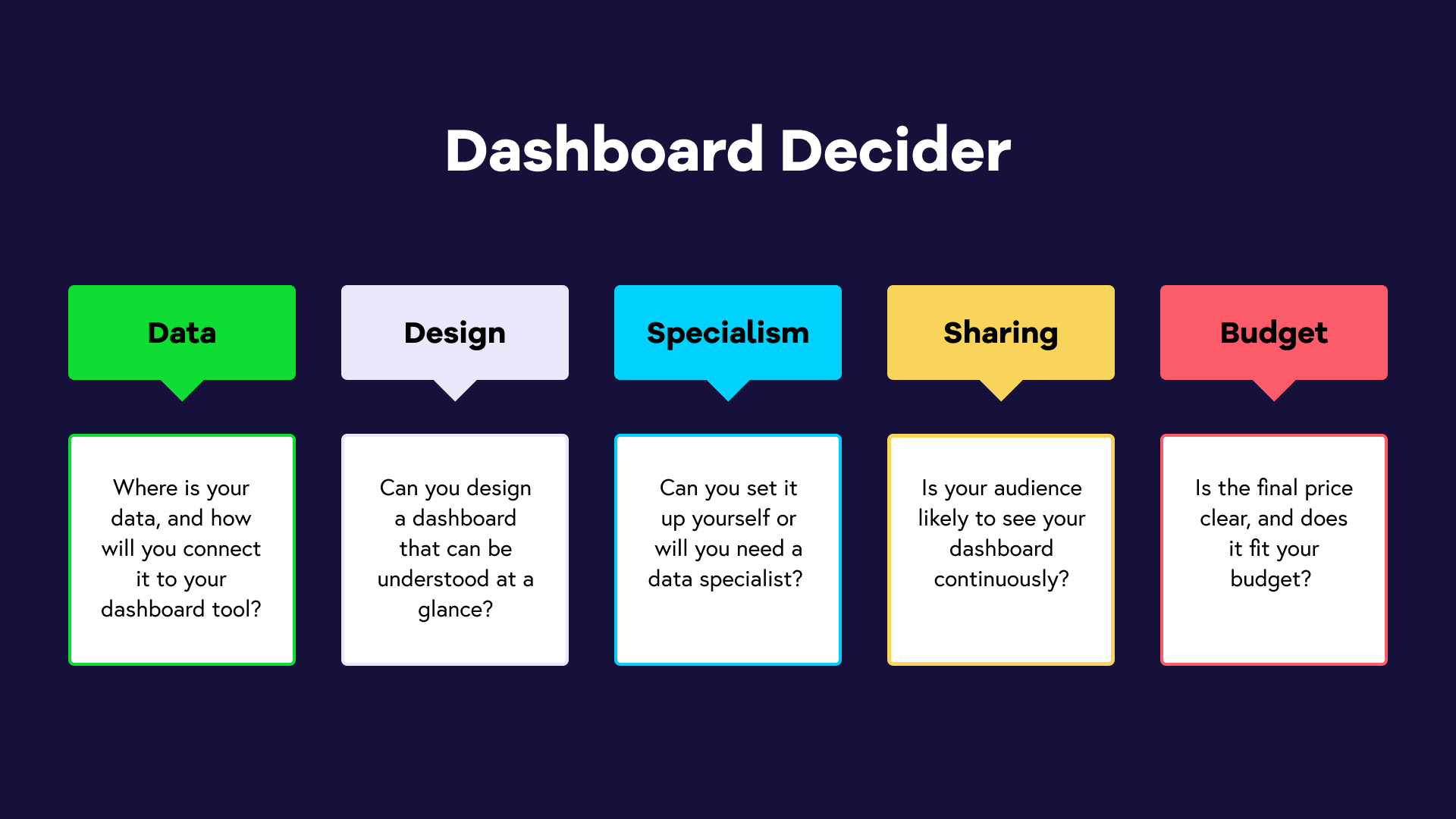
Data
Where is your data, and how will you connect it to your dashboard tool?
Here you need to identify where your KPIs are generated – in a single platform like Salesforce, or across multiple tools?
If they’re generated in a single platform, it’s possible (but not certain) that native reporting features (such as Salesforce Reports) will be sufficient for your needs. If your data is generated in multiple places, you will likely need a tool to pull everything together.
You will also need to work out how often you need your data to refresh, and whether or not this process can be automated.
Design
Can you design a dashboard that can be understood at a glance?
A well-designed dashboard tells you what you need to know – at a glance. Your team uses it because it’s useful, and is the easiest way to access the information they need. Whereas badly designed dashboards are rarely used or adopted.
The more advanced the dashboard software, the more design flexibility you will have. But beware, more flexibility doesn't always equal better dashboards. If you’re using a more complex tool like Looker or Tableau, you will need someone who is skilled at information design.
Also, if you plan on permanently displaying your dashboard on a TV screen, you should be aware that some tools (such as spreadsheets) are not optimized for TV display.
Specialism
Can you set it up yourself or will you need a data specialist?
Some dashboard tools will require specialist teams to set up and maintain. For example, a BI tool like Power BI usually works in conjunction with a data warehouse. Setting up and maintaining the data warehouse will require a data specialist who knows SQL (a coding language for databases).
Sharing
Is your audience likely to see your dashboard continuously?
Your sales dashboard will only work if your team can access it regularly, without any friction. Ideally, you should think about how you ‘broadcast’ your dashboard in the spaces your team spends the most time. Whether that’s in a physical office where you can display your dashboard on a TV screen, or virtually, where you might embed your dashboard into tools like Notion and Slack.
If you’re expecting your audience to remember to check the dashboard, then keep in mind that tools with even light barriers to access, such as logins, drastically reduce the likelihood of widespread usage and adoption.
Budget
Is the final price clear, and does it fit your budget?
Most dashboard software has some form of scaled pricing, based on your usage. That might include per-user pricing, or additional charges for real-time data refresh, or extra data sources.
No doubt, you will have a budget in mind. Just beware these hidden pricing tactics.
Using the Dashboard Decider to assess your options
Next we’re going to use the five areas of the guide to assess some common options for sales dashboards. (But you can use the Dashboard Decider framework for every tool you’re assessing.)
- Google Sheets
- Tableau
- And, of course, Geckoboard.
Google Sheets
A simple KPI dashboard option for any sales team on a budget. Let’s run it through the 5 key criteria.
- Data: The biggest drawback of Google Sheets, or any spreadsheet, is that you're going to need to update your numbers manually. That might be fine if you’re using it as a weekly reporting tool, but anything more regular is going to be unworkable.
- Design: Google Sheets does give you a lot of design flexibility. It’s a fair option for simple tables and visualizations – it’s functional, but not particularly polished.
- Specialism: Turning a spreadsheet into a dashboard does require a bit of thought and planning, but it’s well within the specialism of your average Joe.
- Sharing: Google sheets is very easy to share, but much more difficult to ‘broadcast’. Not a suitable option if you want to display your dashboard on a TV, for example.
- Budget: Free.
Tableau
The market-leading BI tool, and one of the first brands to come to mind when people think about ‘dashboards’. However, you will soon learn that Tableau is only really accessible to large companies with data specialists.
- Data: To use Tableau (or any BI tool), you will first need to create a data warehouse, then establish a connection with the data sources where your KPIs are generated. Because BI tools are generally used for longer term analysis and reporting, not all data warehouses support real-time refresh rates.
- Design: Very comprehensive visualization options. However, to create effective dashboards, you will almost definitely need someone with information design experience.
- Sharing: Includes shareable dashboards, and dashboards that can be optimized for TV display. The main barrier to access is per-user licensing, which can become expensive.
- Specialism: The setup and maintenance of the data warehouse means you will certainly need a team of data specialists who can code.
- Budget: You will need to factor the cost of the data warehouse as well as Tableau, which has a per-user pricing system, which can quickly scale.
Geckoboard
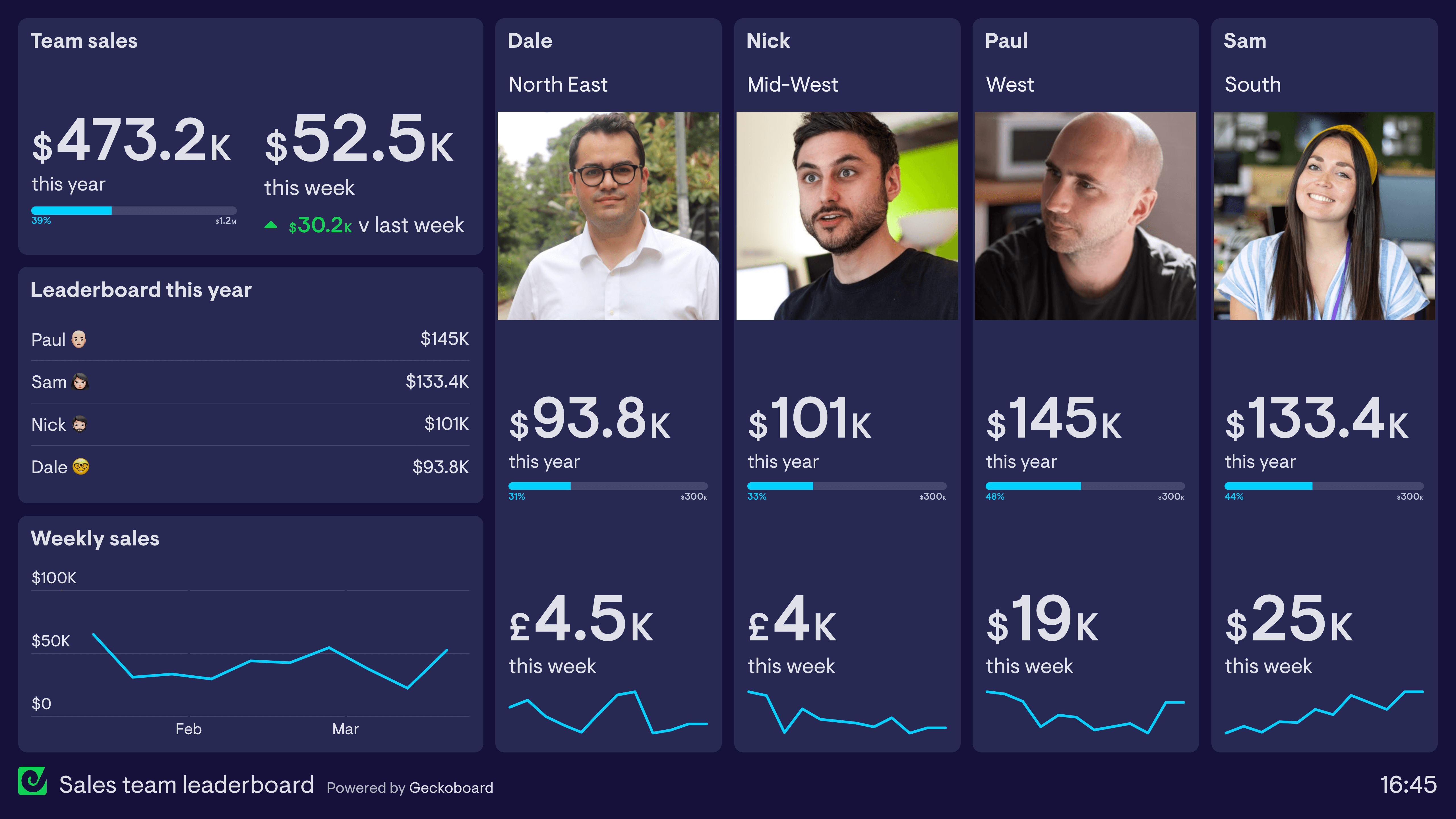
Unlike BI tools, Geckoboard is accessible to small and medium sized businesses who don’t have data specialists. Your biggest drawback is likely to be whether or not we support the data sources you require. Geckoboard is also not a good fit if you are planning to also use your dashboard for data analysis. (Geckoboard designed for KPI visibility, not advanced data analysis.)
- Data: Connects directly to 90+ data sources like Salesforce, Aircall and Pipedrive (with no data warehouse required). It will also refresh your data at the fastest possible rate, regardless of which plan you’re on.
- Design: You will notice the visualization options are more limited than, say, Tableau (or even Google Sheets). This is a feature not a bug. Geckoboard is designed with effectiveness in mind. It’s possible for anyone to create a professional looking, visually effective dashboard, without design experience. That’s why we don’t include visualization-types which are more likely to confuse your audience than inform them (such as pie charts and area charts).
- Sharing: Built with Sharing in mind. You can easily create sharing links, set up regular snapshots for email and Slack, and display your dashboard permanently on a TV.
- Specialism: No specialism required.
- Budget: Geckoboard’s subscriptions start at $39 and the vast majority of our customers pay less than $199 per month.
