We all love spreadsheets, right? They’re great for manipulating and analyzing your business’s data on Key Performance Indicators (KPIs). That’s probably why Excel has over 750 million users worldwide, which is more than 10% of the world’s entire population. However, there is an issue with spreadsheets when it comes to communicating data within a business.
Let's start by clarifying what we mean by “data communication”, as it can mean many things to different people. When we talk about data communication, we mean communication of your business’s most important performance metrics to the entire team. Why is this important, you ask? Well, we partnered with Censuswide recently to survey 2000 employees in the UK and US on the impact of data communication and found:
- Over 80% want their bosses to share more business performance information
- 25% of employees have, or know someone who has, left a business because they were flying blind to company performance and direction
- Over 50% said that company performance information being shared had a significant positive impact on their contribution to company performance
The research also found that more than 1 in 5 businesses currently communicate data using spreadsheets. Now that we know that communicating data to employees in a digestible manner helps improve the performance of your business, and that over 20% of businesses use spreadsheets to do this, what makes spreadsheets so bad for communication? Well, here are the four major reasons why spreadsheets aren’t the tool for communicating data about business performance:
1. Your team can’t identify the most important metrics in the maze of numbers.
Spreadsheets are filled with numbers. Lots of numbers. That’s part of the reason why we all love them: They’re great for manipulating and analyzing huge volumes of data. However, it’s also a big part of the reason why they suck when it comes to data communication.
Sending your team into a spreadsheet filled with numbers is like letting them walk into a data-filled minefield. With so much data it’s hard to identify what are the most important metrics and also what the key movements are. This leads to two issues. Firstly, it makes it hard for your team to identify the impact of their work on movements in KPIs for the business. Secondly, the data volume can easily lead to misinterpretation of data and ultimately your team taking incorrect actions based on that misinterpretation.
2. You might use 3D charts or visualizations which lead to misinterpretation.
Ben Shneiderman is an American computer scientist, and professor. He conducted fundamental research in the field of human–computer interaction, developing new ideas, methods, and tools. Ultimately, he knows a lot about data visualization for humans and is credited with the quote:
“The purpose of visualization is insight, not pictures.”
However, many people ignore this great advice when using spreadsheets for data visualization. There are two particularly common ways in which people try to draw nice pictures rather than deliver insight when using spreadsheets to visualize data.
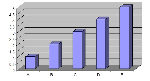
Firstly, they use 3D charts because tools like Excel lure you into this. The use of 3D charts distorts the reality of data by making it difficult to identify the actual data points. For example, compare this:

To this:

The same data gets interpreted very differently when you view it 2D vs 3D. Whilst 3D charts may seem more attractive, your team will misinterpret data and make incorrect decisions when using them.
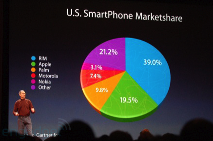
Secondly, the huge volume of visualization options in Excel can lead to the use of visualizations which cloud the meaning behind the data. A great example of this is the use of pie charts to visualize certain data, which can lead to misinterpretation. Data visualization expert Edward Tufte gave pie charts a damning review on Twitter by suggesting:
“Pie chart users deserve same suspicion+skepticism as those who mix up its/it’s, there/their…”
An aggressively made point, but understandable when you compare this:

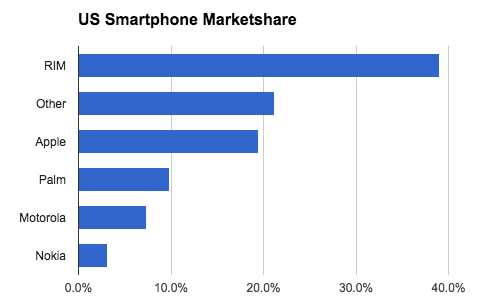
To this:

There are two major ways pie charts distort the reality of data. Firstly, the brain’s not very good at comparing the size of angles and because there’s no scale, reading accurate values is difficult. Secondly, as you add more segments and colours, the problem gets worse as the human brain uses colour as a primary attribute to digest a data visualization. Using too much leads to slow digestion and potential misinterpretation of data.
3. Only you, or a select group have access to it.
The problem with spreadsheets is that they aren’t eminently shareable. This is improving with tools like Dropbox, Google Drive and OneDrive, which allow several members of the same team to collaborate on the same file. However, for many businesses spreadsheets are still locked away on the computers of management teams, creating a culture of “information is power”. Meanwhile, many of the world’s highest growth companies such as Buffer and Shopify are moving in the opposite direction and adopting a completely transparent culture where employees can see everything in terms of company performance.
This has two distinct advantages. Firstly, team members can always see how the company is performing, which means they can prioritise their actions more effectively and ultimately help drive company performance.
Secondly, in a study entitled "Trust that Binds: The Impact of Collective Felt Trust on Organizational Performance", Sabrina Deutsch-Salamon and Sandra Robinson proved that employees who feel trusted by their organization become more willing to accept responsibility for their organization’s performance. Their research showed that collective trust felt among the employees led to the development of high responsibility norms and that the employees’ willingness to be accountable for the performance of their organization led directly to better sales and customer service. Being transparent and building trust will help drive growth, so stop locking those spreadsheets away on the drives of a select few, and start sharing the data to build trust!
4. Best case, you might email it out once a week.
Of the employees we surveyed, nearly half had company performance data communicated to them via email. Interestingly, the Radicati Group found that in 2014 there were 108.7 billion business emails sent every day and business users send and receive on average 121 emails per day. When you pull these two facts together, it’s clear that communicating data in spreadsheets via email is far from ideal due to the sheer volume and noise in people’s inboxes diluting the really important data you’re communicating. As such, your data communication is hazy rather than completely transparent. Also, (despite being a communication channel) email does not encourage conversation about the data. It’s sent, read and forgotten. To build a truly transparent and data-driven culture, it’s important to present data in a way that encourages your team to discuss the data and hypothesize based on it.
In Summary
Stop communicating data to your team members using spreadsheets and email! Focus on communicating data in the following ways:
- Make the key data points easily identifiable.
- Visualize the data in ways that reduce the potential for misinterpretation.
- Visualize data in a way that’s actionable and indicative of performance.
- Make data available to everybody, not just a select few.
- Encourage conversation about the data to build a data-driven culture.
Obviously we’re biased, but we believe communication of data within businesses is a very real problem that needs addressing. However, maybe we’re giving spreadsheets a hard time here? If you think there are benefits to communicating data via spreadsheets we’d love to hear your opinions in the comments.

