What is a sales dashboard?
A sales dashboard is a single screen showing your team’s most important sales metrics, updated automatically from your CRM.
It brings metrics like revenue against target, pipeline health, and rep activity into a single view. Reps can see where they stand, while managers can spot problems while there is still time to do something about them.

The last thing you want as a sales leader is to become the middleman between your team and their data. When teams have direct access to their own performance, they start to self-correct, and managers get to spend more time coaching instead of pulling reports.
Compared with sales reports, which look backward at yesterday, last week, or last quarter, sales dashboards focus on what is happening now.
They are:
- Pre-defined. You decide what matters up front, then keep track of it.
- Live. The data updates continuously.
- Curated. They are limited to a small number of important KPIs, rather than every metric you could possibly measure.
- Glanceable. They are designed to be understood in seconds, including from across a room.
Their purpose is to give people the feedback they need to act while they can still affect the outcome.
Sales dashboard examples
There is no single sales dashboard template that works for every team. Team size, sales process, go-to-market strategy, current priorities, and even team personality all affect which dashboards you need and what should go on them.
Most teams end up using multiple dashboards: a wallboard the whole floor sees throughout the day, separate views for managers, personal dashboards for individual reps, and boards built around specific teams, products, or projects.
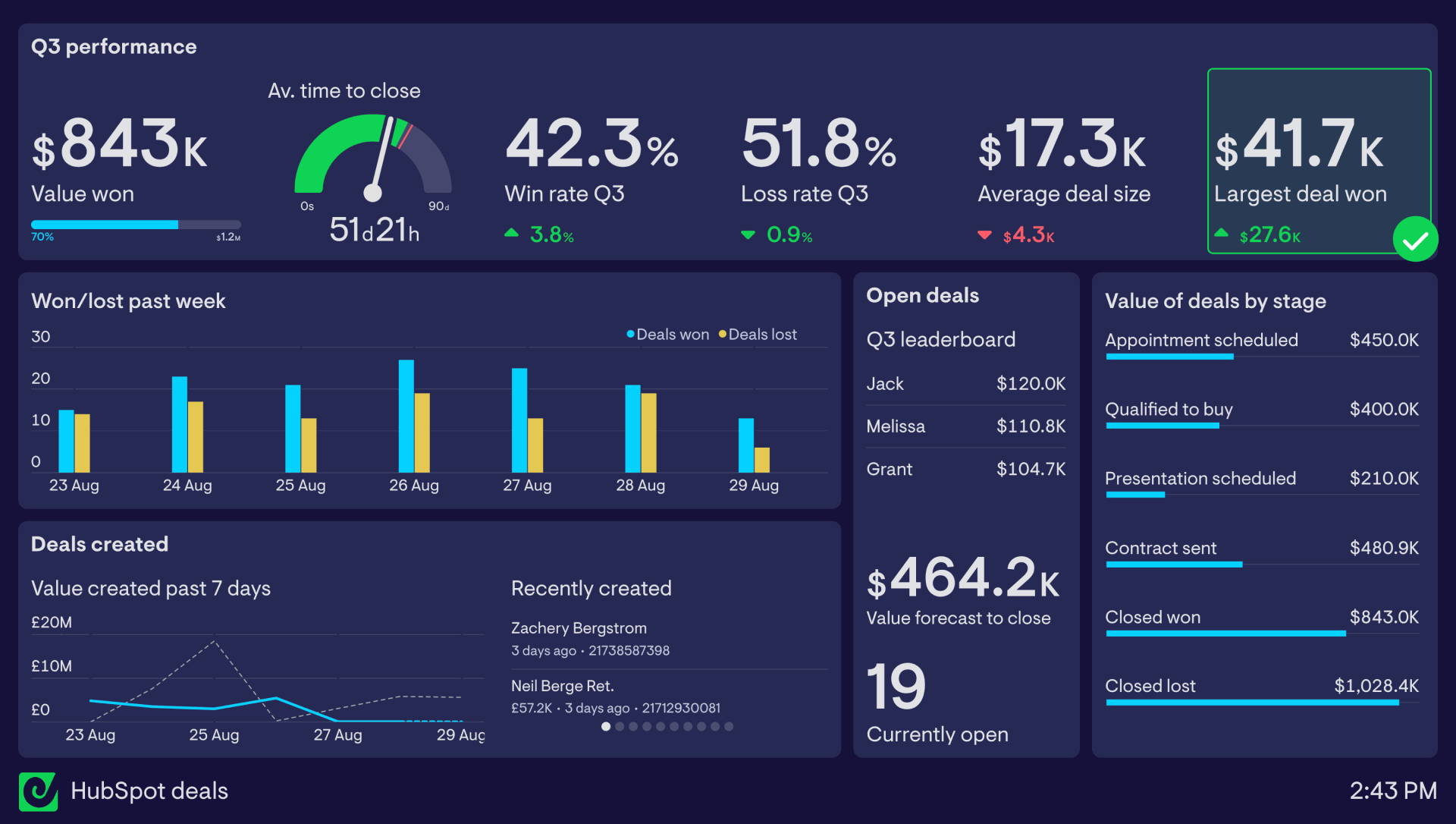
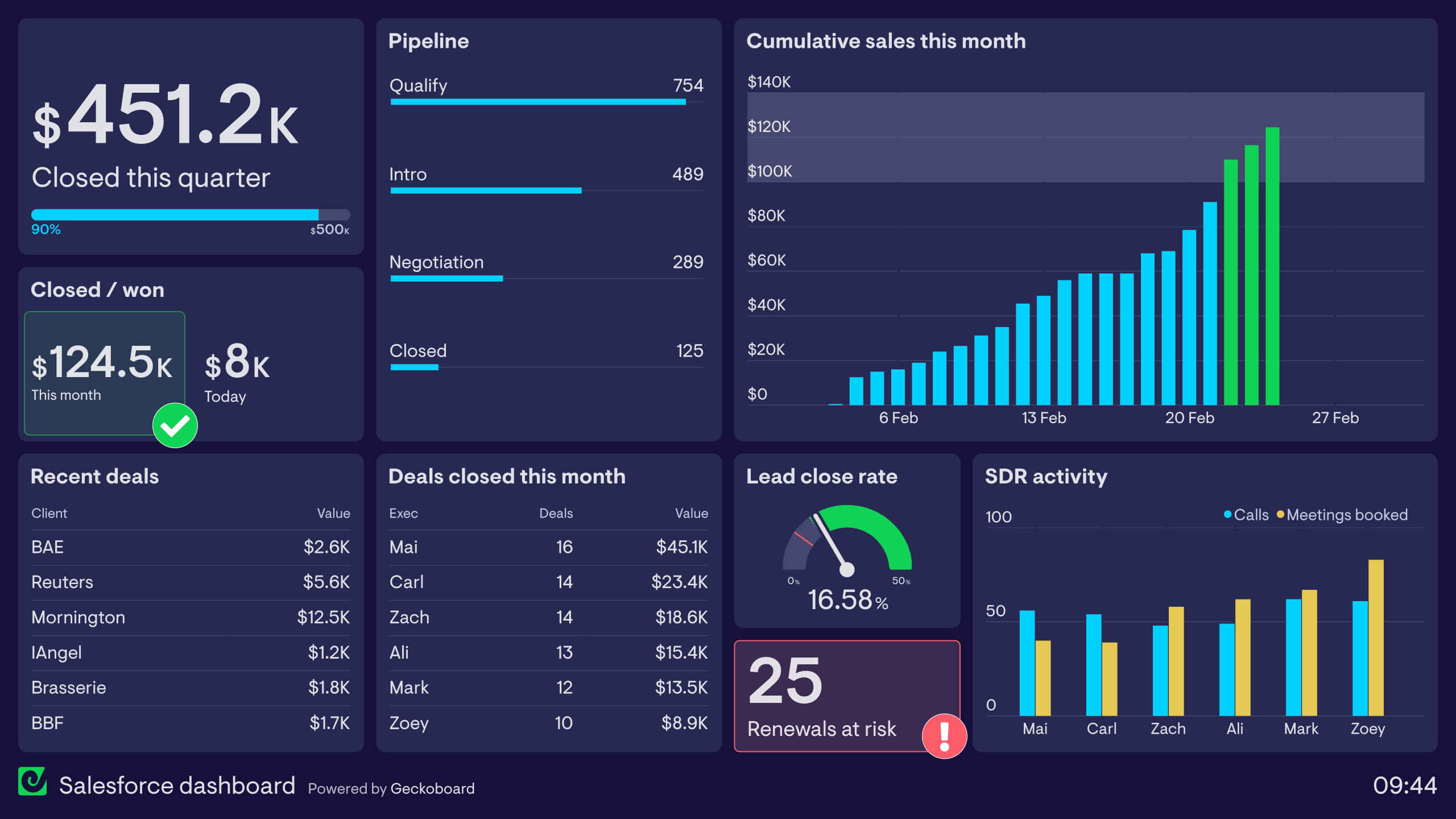
Here are some sales dashboard templates we see our customers use.
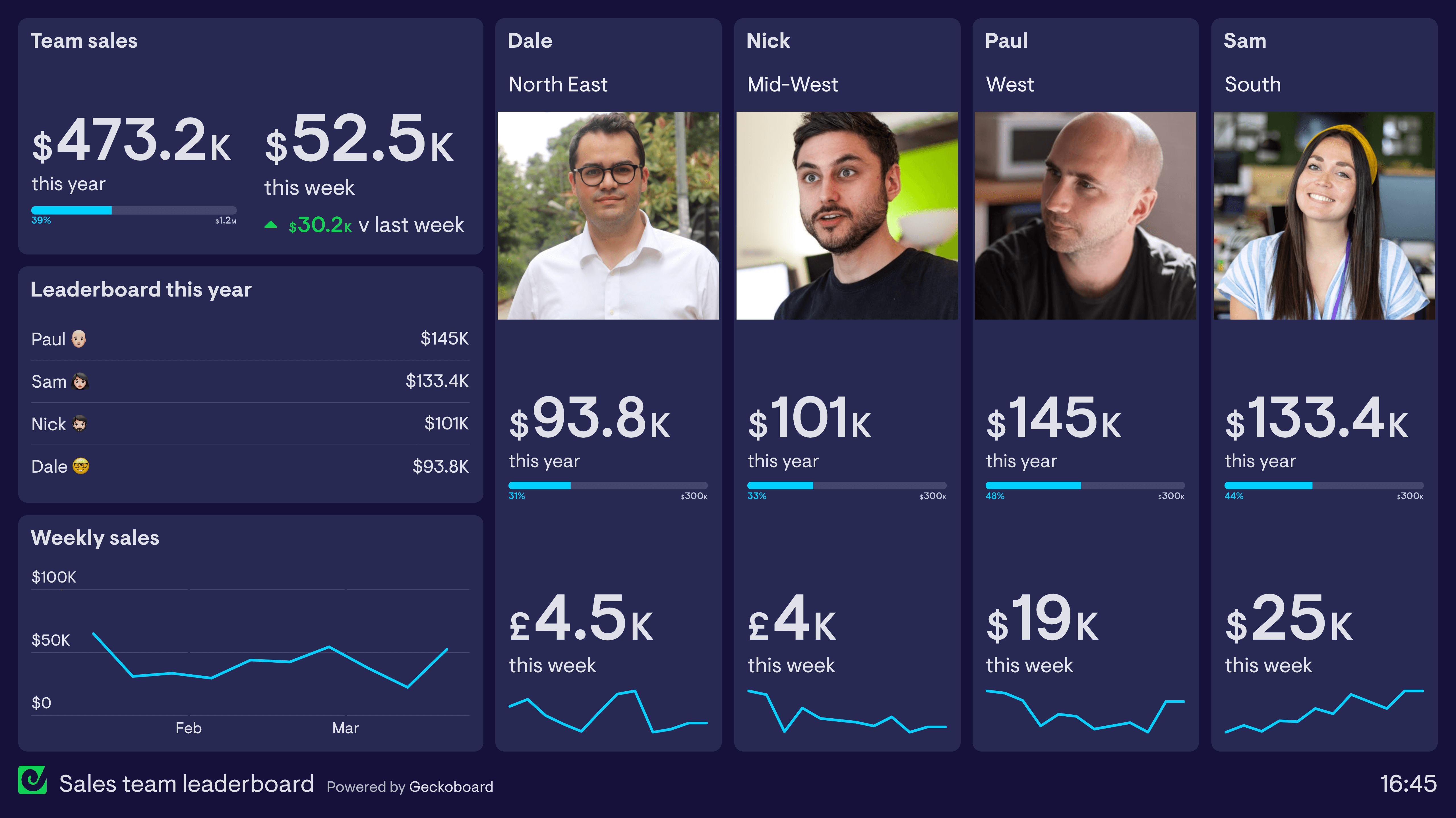
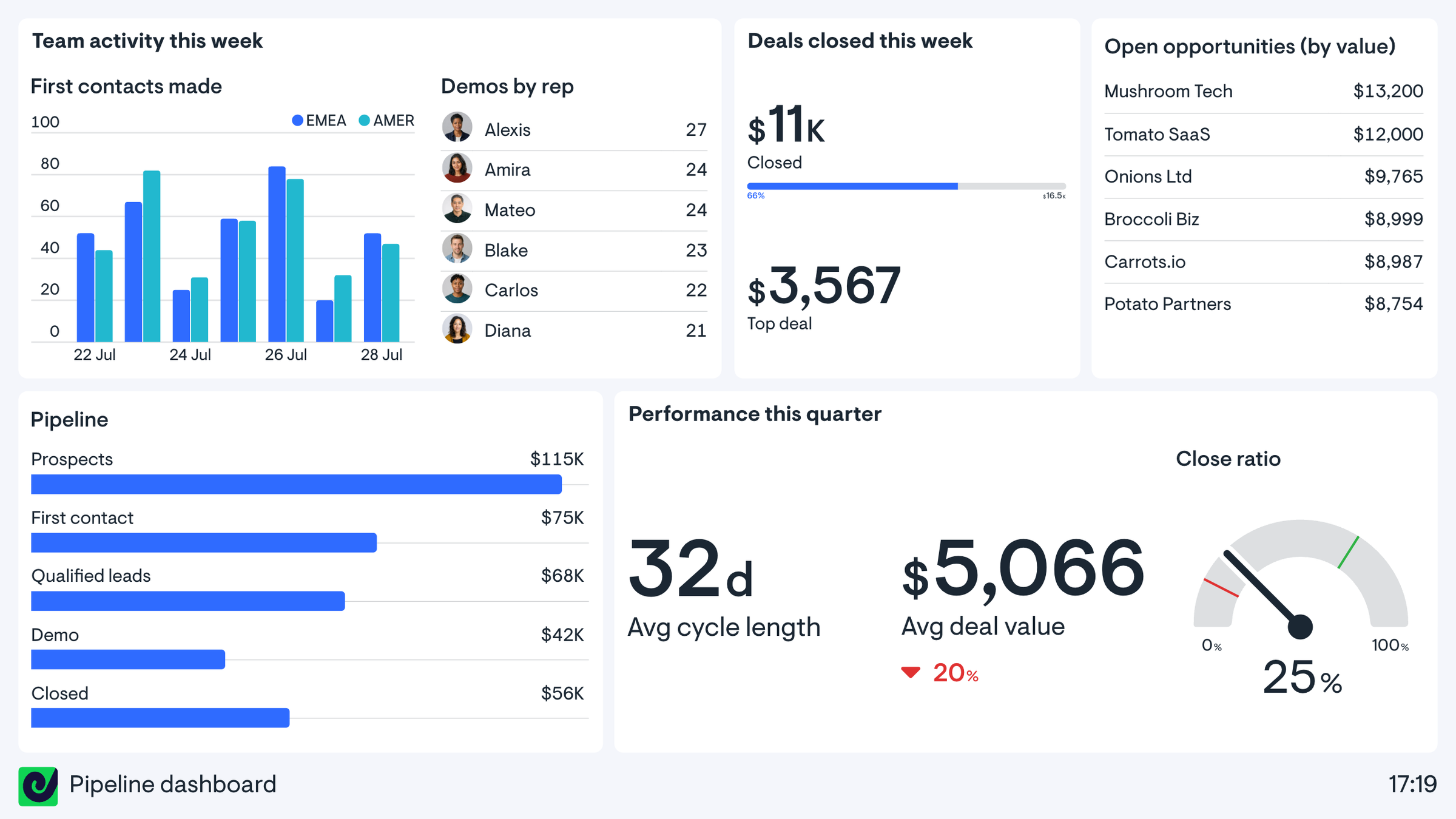
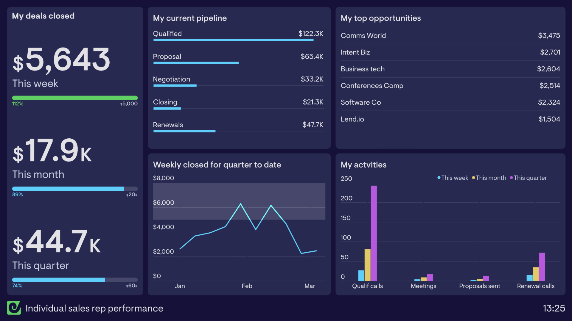
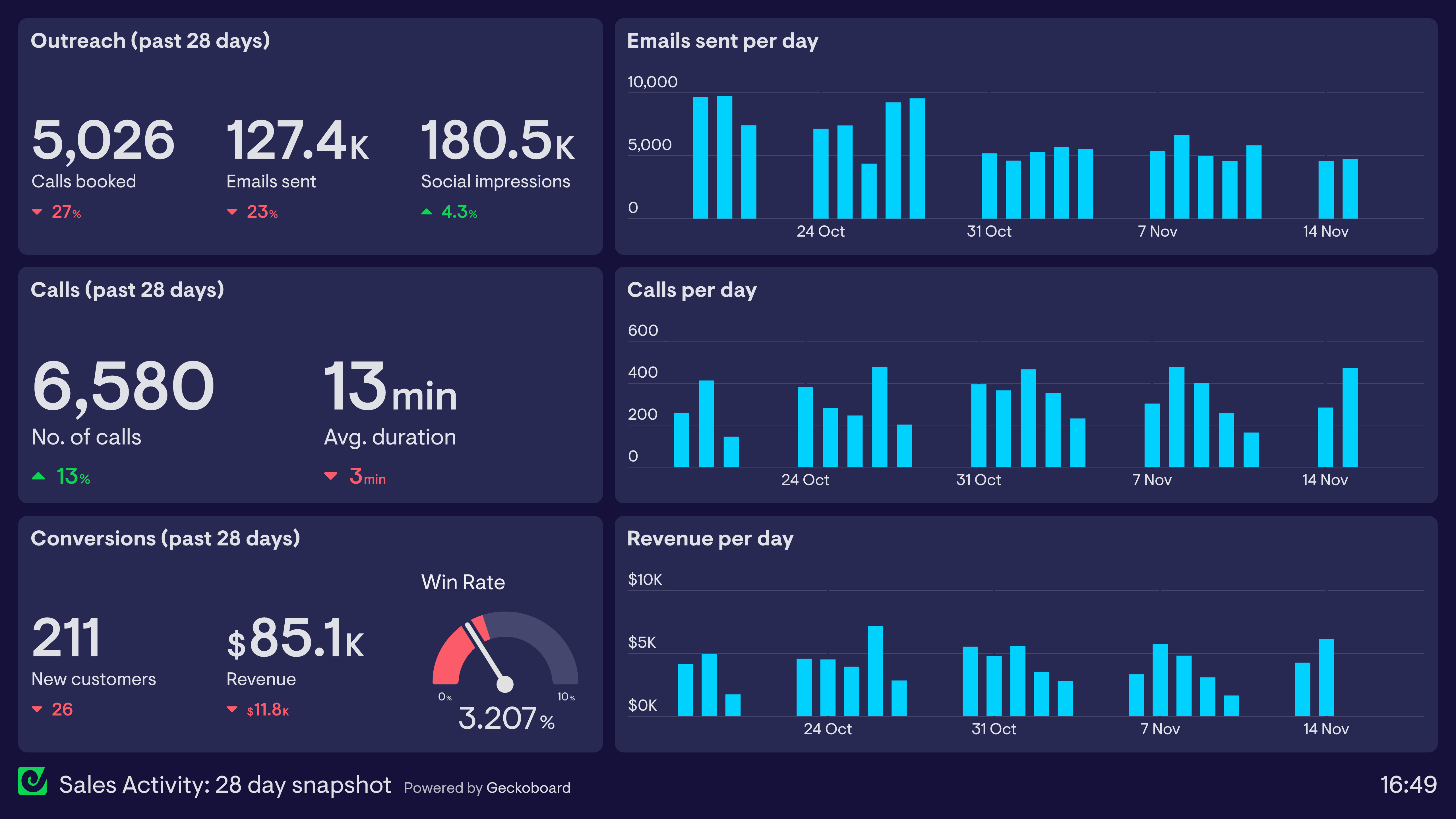
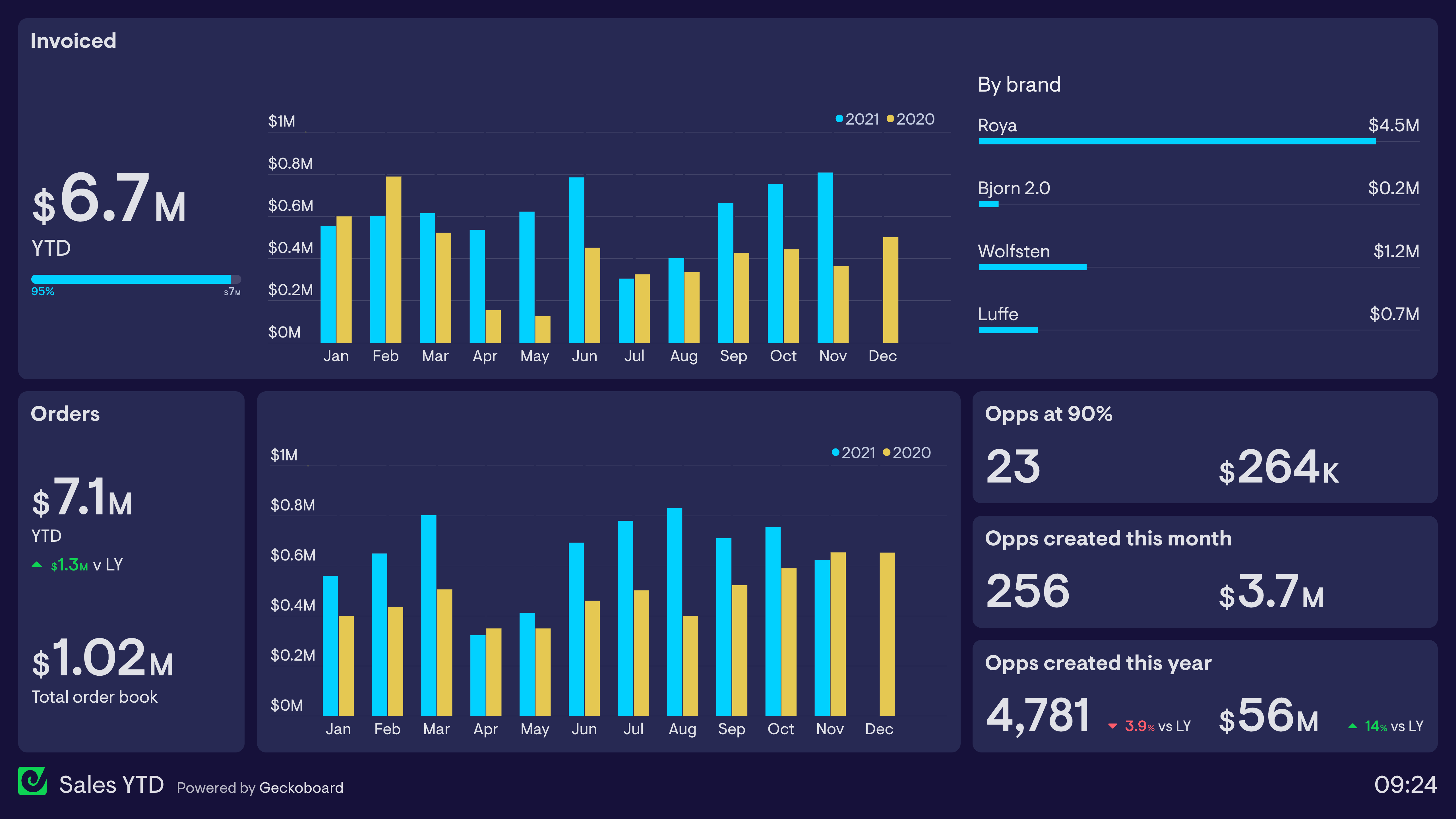
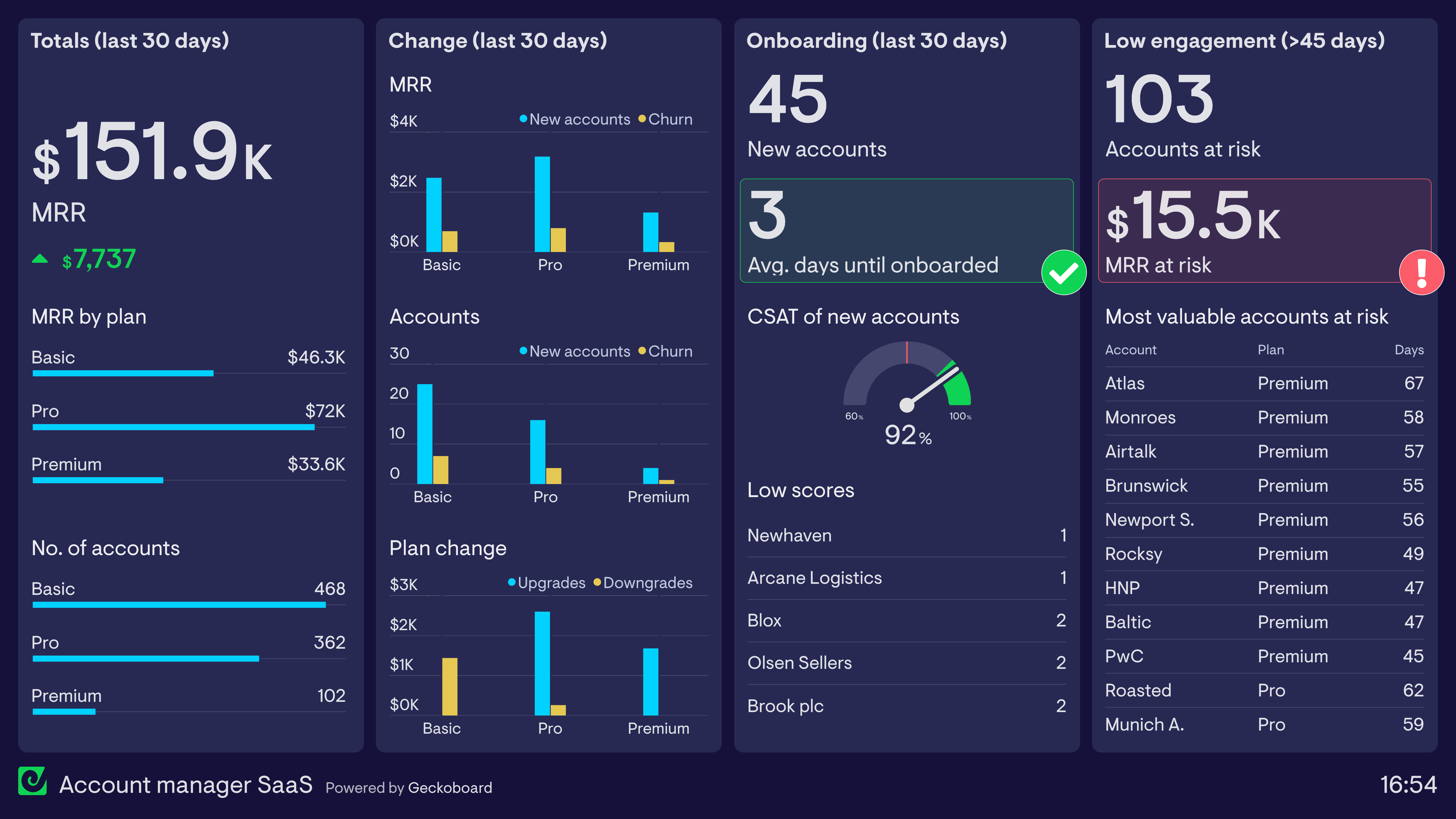
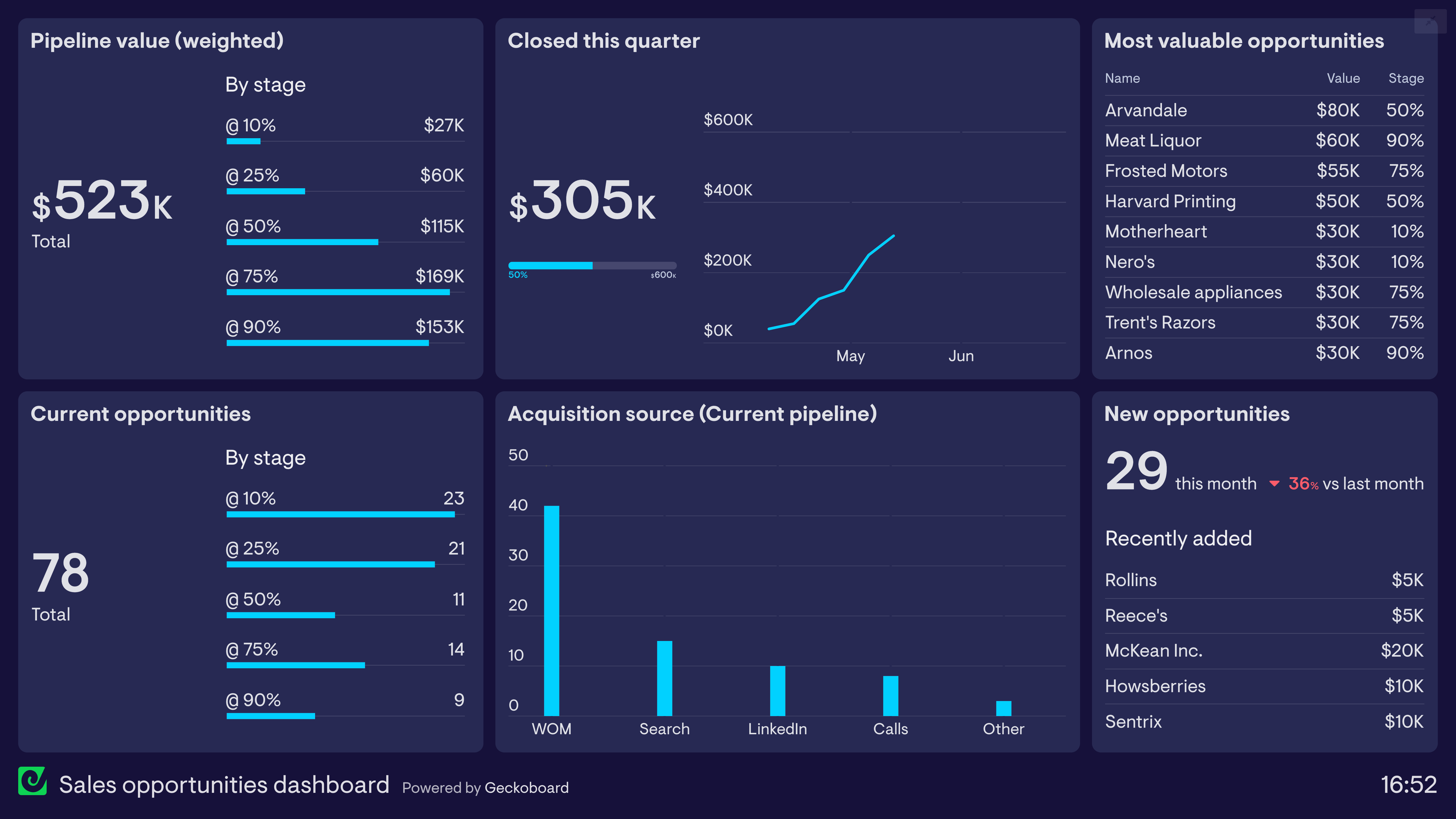
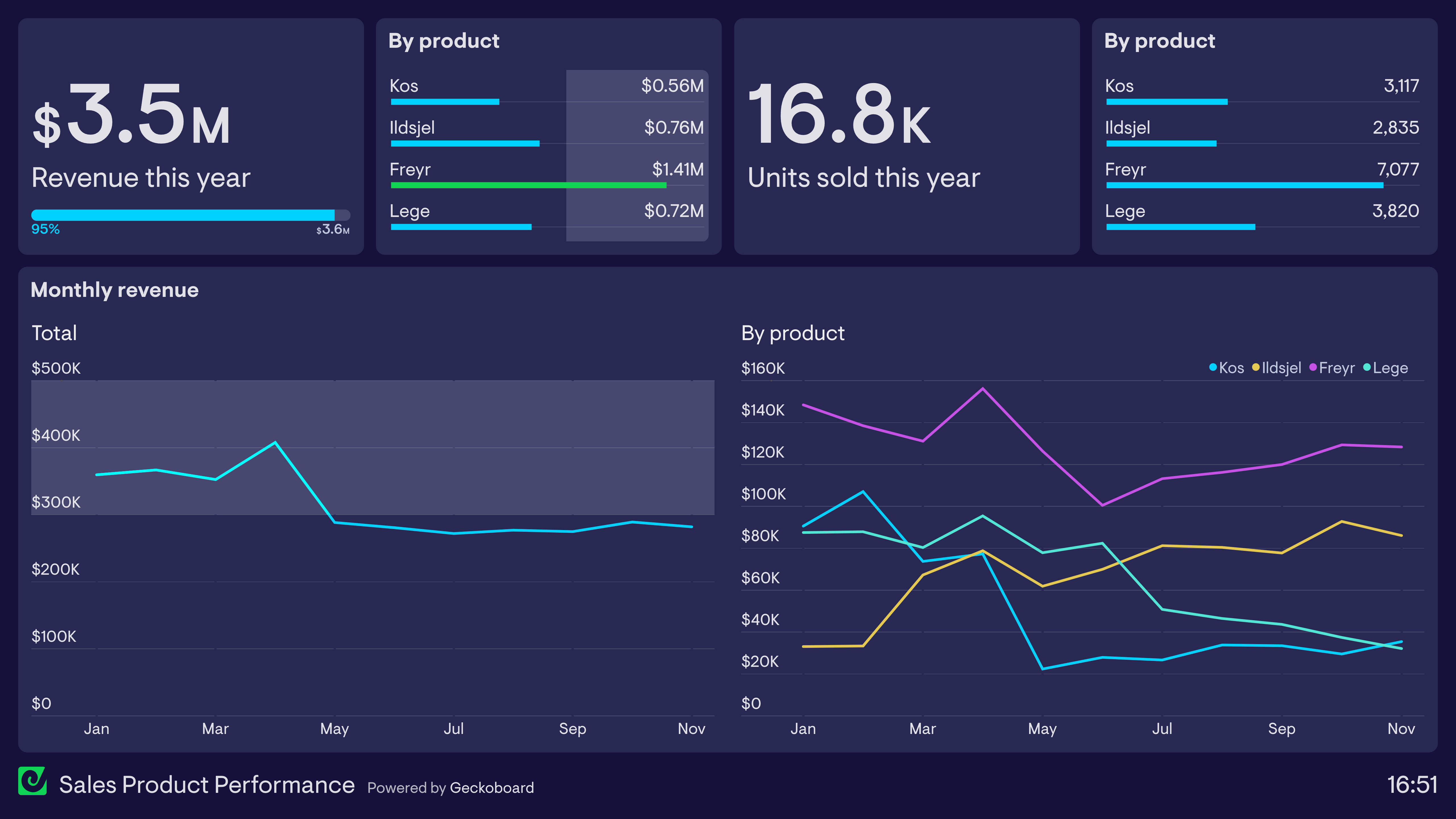
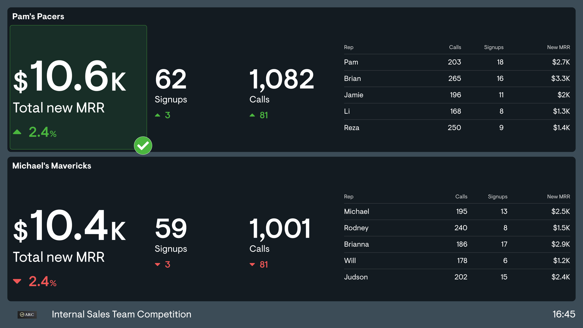
Sales leaderboard
Rep-by-rep ranking on one metric, usually closed-won value or meetings booked. Runs continuously or as a one-off contest.
See more sales leaderboards
Sales pipeline dashboard
Deal flow by stage, value at each step, and where things are getting stuck. Built for forecasting and pipeline reviews.
See more sales pipeline dashboardsSales rep dashboard
One rep’s numbers: their quota, their activity, their deals. Usually viewed on a personal screen rather than a shared one.
See more sales rep dashboardsSales activity dashboard
Calls, emails, demos, and meetings booked. The leading indicators, tracked daily. Most useful for BDR and SDR teams.
See more sales activity dashboardsSales manager dashboard
Team performance against target, pipeline by stage, and rep-level results in one view. This is what most people mean by a sales performance dashboard.
See more sales manager dashboardsAccount manager dashboard
Renewal dates, account health, and expansion opportunities across a book of business.
See more account manager dashboardsSales opportunities dashboard
Which deals are live, what they are worth, and which ones need a next step. Useful when a stage-level view is too aggregated to act on.
See more sales opportunities dashboardsSales product performance dashboard
Revenue broken down by product or service line, showing what is selling and what is not. Useful for teams with a broad catalogue.
See more sales product performance dashboardsHubSpot sales dashboard
Deals, pipeline, and rep activity dashboards for teams using HubSpot as their CRM
See more hubspot sales dashboardsSalesforce dashboard
Dashboards that combine Salesforce data with other sources for a comprehensive view.
See more salesforce dashboardsSales dashboard KPIs and metrics
The two biggest decisions when building a sales dashboard are which metrics to track and how to visualize them.
A leaderboard creates competition. A cumulative line chart showing revenue against target makes it obvious whether the team is on track. A status indicator highlights when something has moved outside an acceptable range.
How you present the data is not limited to charts and numbers. Dashboards can also include feeds showing newly won deals, fresh leads, or meetings booked as they happen. These give the team a sense of what is going on that a number on its own cannot.
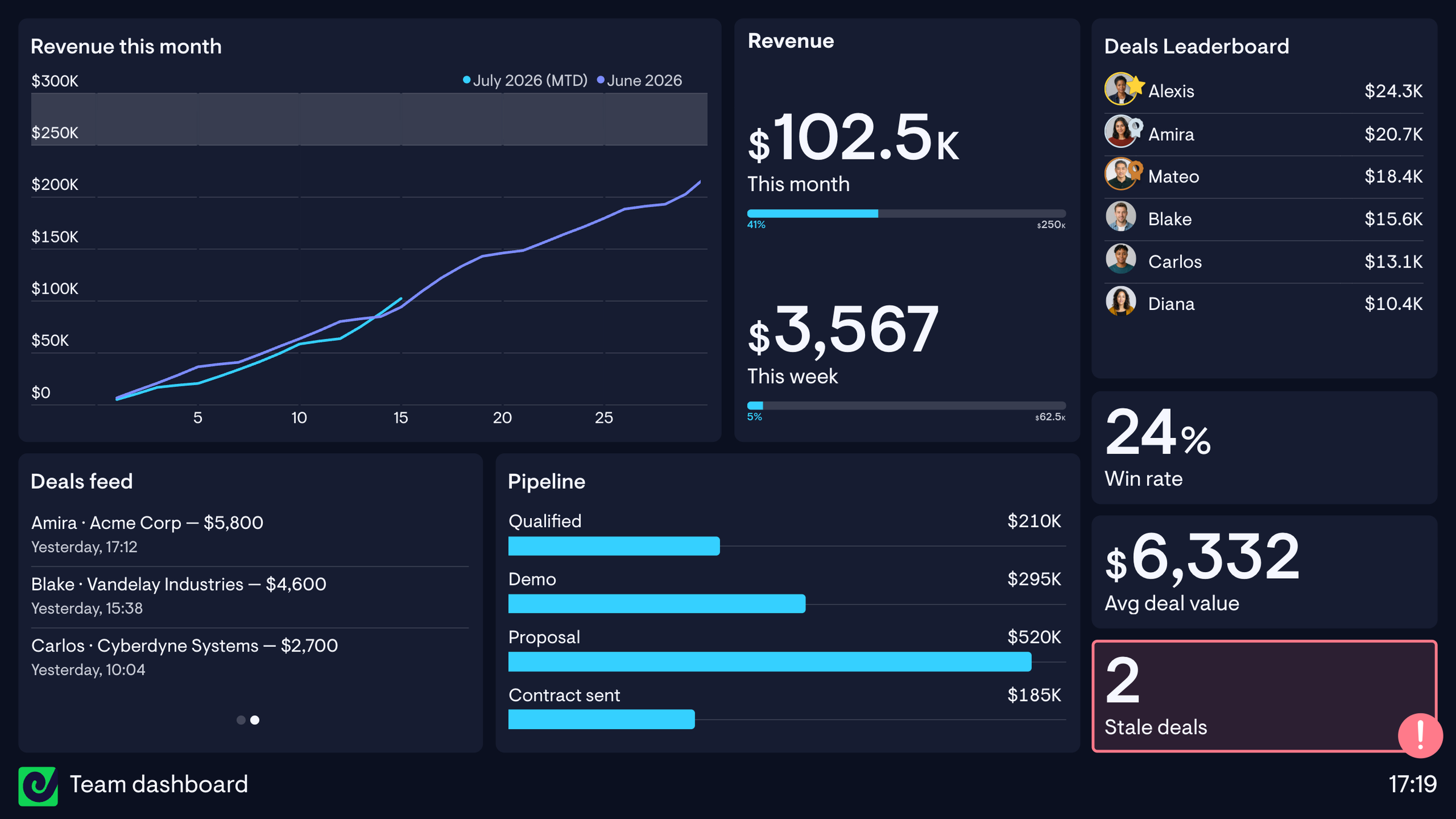
Sales metrics generally fall into two categories:
Outputs: what you are trying to achieve
Revenue · Number of deals closed
Inputs: the activity that produces those results
Calls per rep · Meetings booked · Lead response time · Pipeline volume
People can get into heated arguments about whether sales teams should focus on activity or results. The answer is that you need both.
You probably already have a good idea of which KPIs matter most to your team.
Not all of them will make sense on a dashboard, though. Some metrics are too noisy to be useful over short periods. Win rate, for example, can jump around significantly from one week to the next, so it is often better reviewed monthly or quarterly than displayed as a daily number that is effectively random.
What should be on a sales dashboard comes down to who is looking at it and how often. Here are the metrics we see sales teams use most often. In practice, teams will often apply additional filters, such as restricting a metric to a particular sales region.
Common sales metrics
| Metric | What it tells you |
|---|---|
| Revenue vs target | Overall performance against plan |
| Quota attainment | Where each rep stands against their target right now |
| Deals closed vs goal | Progress this period, broken down by rep |
| Win rate | What proportion of qualified opportunities go on to close |
| Pipeline volume vs goal | Whether there is enough pipeline to hit the target |
| Average deal size | Whether the team is winning the right kind of deals |
| Average sales cycle length | How long deals take to close, and whether that is changing |
| Activity per rep | Whether reps are doing enough of the work that creates pipeline |
| Meetings booked | One of the clearest input metrics for BDR and SDR teams |
| Lead response time | How quickly inbound leads actually get contacted |
| Deals with no next step | Where deals go to die |
| New MRR closed vs quota | Recurring revenue against plan |
What makes a good sales dashboard
A sales dashboard should be judged on one thing: whether it changes what the team does.
Choosing the right metrics is most of it. But there are also specific approaches that make a dashboard far more likely to be noticed and used.
Some basic rules apply to every dashboard. Use simple visualizations. Do not overfill it. Label metrics clearly. Group related information together. Review it regularly and cut anything people no longer look at. We cover those principles in more detail in our dashboard design guide.
The rules below are more specific to sales dashboards. They are based on what I have learned from years of watching sales teams build and use them.
1. Include both input and output metrics
As I mentioned in the previous section, you need both. There really is no argument to be had.
Focus only on activity and you risk encouraging busywork. Reps can game call counts and emails sent without ever moving a deal forward.
Focus only on outcomes and you lose sight of the activity that produces them. By the time revenue falls behind target, it may already be too late to fix the problem.
The classic framing comes from John Doerr. You do not win a football game by staring at the scoreboard. You win by executing the plays that put points on the board.
The score tells you whether you are winning. The plays are what you can actually control.
A good sales dashboard shows both, so you can spot a problem in the inputs before it shows up in the results.
2. Show team performance, not just individual rankings
Sales can feel like an individual sport. Every rep has their own quota, their own pipeline, and their own commission.
One of the most useful things a shared dashboard can do is bring the focus back to the team.
Show the collective number prominently: total revenue against target, meetings booked across the team, or deals closed this month.
Individual leaderboards still have a place, but they should connect back to a shared goal. It is a team, after all.
This also gives people who are not currently topping the leaderboard a way to see how they are contributing to the overall result.
3. Keep it feeling current
Dashboards are much more effective when things visibly change.
If reps see the same static numbers every time they look up, they develop dashboard blindness and stop noticing it. A long delay between something happening and appearing on the dashboard has the same effect.
Feeds are a good way to prevent this because they show individual events as they happen: newly closed deals, fresh leads, or demos booked.
Over time, the team develops a feel for how the day is going. People notice when calls are unusually slow, when leads are piling up, or when three deals close in an hour.
This is also where real-time updates earn their keep. A deal appearing on the wallboard moments after it closes gives the team something to react to. A dashboard that refreshes once overnight does not.

4. Pick one specific area to improve
As a sales leader, there is usually one part of the process you are particularly focused on fixing. Put it on the dashboard.
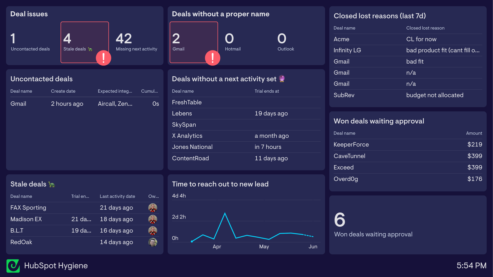
It might be lead response time, stale deals, missing next steps, or follow-up attempts.
Giving it a dedicated place makes it clear that it matters and stops it disappearing behind the usual revenue and pipeline numbers.
It does not need to be permanent. Change the focus metric when your priorities change.
Keeping a specific problem on the dashboard also acts as a constant reminder to the team that it needs attention.
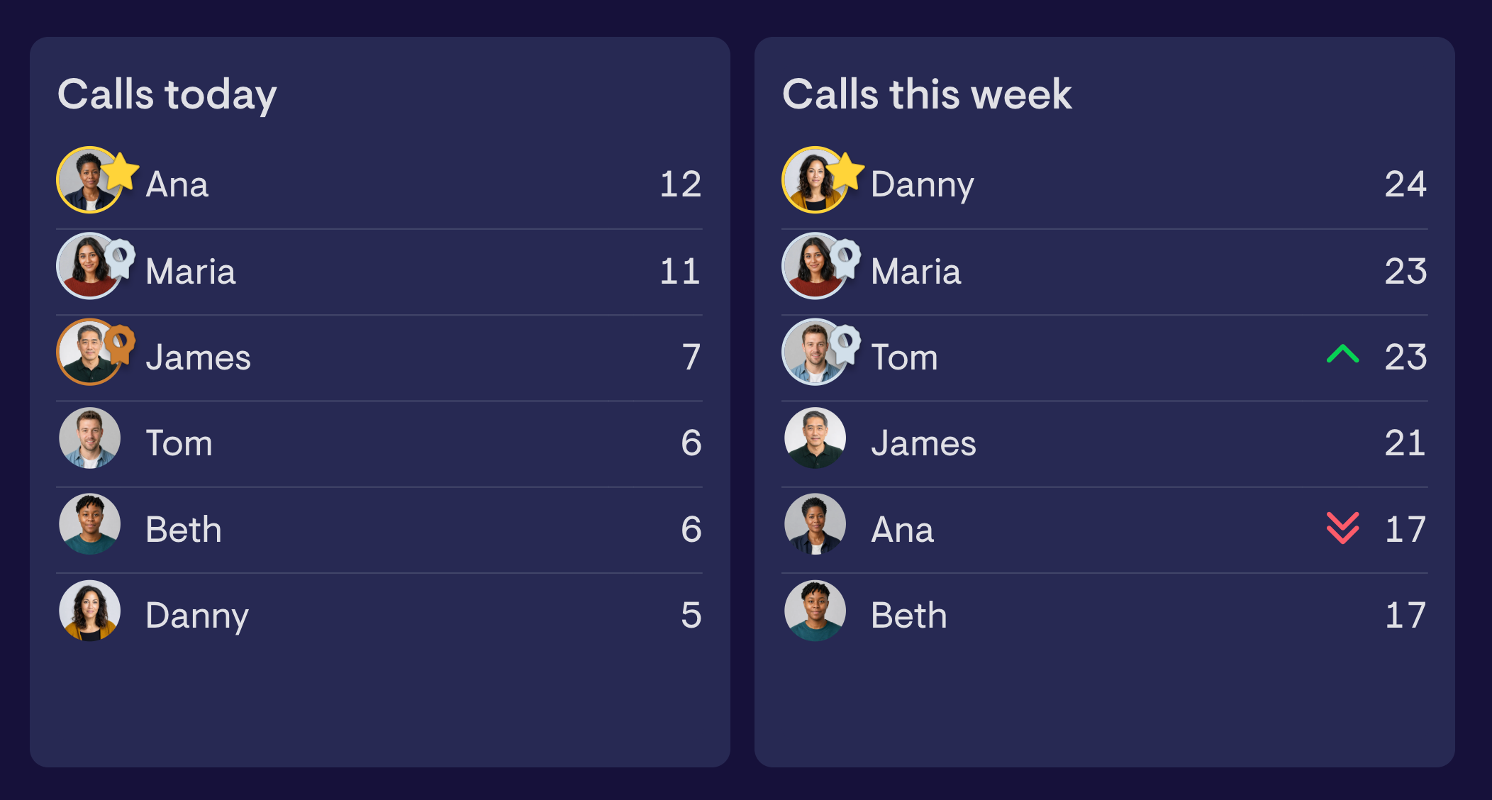
5. Use more than one timeframe for leaderboards
Leaderboards are at the heart of many sales dashboards. For AEs, they usually rank closed-won revenue. For BDRs, they usually show meetings booked.
The timeframe you choose matters more than most people realize.
Quarterly rankings map most closely to actual rep performance, but they do not always drive the best behavior. If someone builds a big lead early, everyone else may stop feeling like they can catch up. If you are already at the top, you may not push as hard for the rest of the quarter.
For BDR and SDR teams, daily and weekly leaderboards usually work better. You want people pushing to book meetings every day, not scrambling to catch up on a Friday afternoon.
That does not mean putting five rankings on one screen. Keep it to two. If you want a longer-term view as well, put it on a separate dashboard and rotate between them.
6. Make it feel like the team’s dashboard
The best sales dashboards have some personality.
When a dashboard feels like something the team helped shape, rather than a reporting tool imposed by management, people are more likely to engage with it.
How far you take that is up to you. Rep photos, fun avatars, a team theme, a motivational GIF, emoji, or a sound when a deal closes can all help.
None of those things improves performance on its own. Together, they can make the dashboard feel like part of the team rather than another management tool.
A dashboard the team feels ownership of is a dashboard they are more likely to watch.
“As soon as screens started rotating, graphs started changing colors at certain milestones, and dashboards were personalized to individual reps' needs, morale, activity, and results have all noticeably grown.”
Jacob Narson, Head of Data and Analytics, Tixta
What difference does a sales dashboard make?
Sales dashboards are not just a nice-to-have.
Making performance visible changes how sales teams behave. In my experience it shows up in five ways: activity goes up, pipeline problems surface earlier, CRM hygiene improves, forecasts become more reliable, and managers spend less time assembling reports and more time coaching.
The hygiene and forecasting gains come from the same mechanism. Once missing next steps and stale deals are on a screen the whole team can see, rather than buried in a report nobody opens, they get fixed. Better data going in is what makes a forecast worth trusting. We have written about how teams do this deliberately with a HubSpot hygiene dashboard.
There is research behind parts of this too. A study of more than 27,000 salespeople found that performance rankings affected both quota attainment and rep retention. It also found that the way those rankings were presented changed the effect they had.
The financial impact adds up quickly. For a ten-person team carrying $5 million in annual quota, a 5% improvement in attainment is worth $250,000.
Retaining one experienced rep who might otherwise have left protects tens of thousands more in recruitment costs, ramp time, and lost productivity.
“Since I implemented Geckoboard, we had our first month of 10% month-over-month revenue growth. It made it easier to see we were on track across all the leading indicators.”
Christopher Ford, Director of Growth, HappyDoc
There is a time saving too. Salesforce found that reps spend only 28% of their week actually selling. The rest goes on administration, data entry, and deal management.
Managers lose time in similar ways. Pulling reports together, checking whether the CRM is up to date, and answering questions about performance all take time away from coaching. Research covered by Harvard Business Review found that coaching has more impact on rep performance than any other management investment.
“It saves me an hour a day. That’s five hours a week I’m not pulling data.”
Hayden Gutteridge, Operations Manager, Octopus Legacy
A dashboard does not sell anything by itself. What it does do is help a team see where it stands, respond sooner, coach more effectively, and spend less time working out what has already happened.
How to create a sales dashboard
Most people building a sales dashboard do not start with a blank page. They start by picking a tool, and that choice shapes everything that follows: how often the data updates, whether anyone outside the sales team can see it, and how much of it you can change without asking for help.
There are three broad approaches, and the right one depends mostly on who needs to see the result.
Your CRM’s built-in reporting
CRMs like HubSpot, Salesforce, and Pipedrive all include reporting tools. They are highly customizable and have ready access to the data already held in your CRM.
The downside is that dashboards are often just a slightly different version of the reporting system rather than a product designed for putting performance in front of a whole team. They are primarily built for managers and analysts.
They usually update less frequently than you need, work poorly on a shared screen, and require people to log in and find them. It can also be difficult to combine CRM data with information from other tools, such as your call platform or a spreadsheet of targets.
That last point matters more than it sounds. Bringing a second source alongside your CRM, a spreadsheet of targets, a call platform like Aircall, or the marketing tool feeding leads into the team, is almost always more useful than adding another CRM metric.
A BI tool on your data warehouse
Past a certain size, many companies replicate large amounts of sales data into a warehouse and report on it using a BI tool.
That gives you a lot of control, but it also creates a lot more work.
Building or changing a dashboard often needs help from a data team. Pipelines often only refresh overnight, and the warehouse seldom contains the operational detail a sales team cares about during the day.
The output is generally designed for analysis rather than for a team to keep on screen and use throughout the day.
A dedicated sales dashboard tool
This is what we built Geckoboard for.
Pre-built integrations let a sales team connect its own tools and build a dashboard without waiting for IT or a data project.
CRM data, call data, targets, and other information can sit on the same dashboard and update in real time. You can add leaderboards, feeds, status indicators, and celebrations when deals close.
Sharing is a core part of the product rather than an afterthought. Dashboards are designed for wall-mounted screens, but can also be shared through Slack, links, and mobile devices. That matters because a dashboard people have to remember to log in and find will quickly be forgotten. Teams are never as proactive about checking their data as managers would like them to be.
Metrics can link back to the underlying records, so a manager can move from noticing that something is wrong to working out why.
And that concludes our guide to sales dashboards. If you’ve made it this far, don’t stop here. It’s time to bring real-time dashboards to your sales team.
By Tom Randle, CEO, Geckoboard · Last reviewed July 2026