HubSpot Sales dashboard examples
A HubSpot Sales dashboard brings key metrics from HubSpot Sales Hub into a view that's built for your team — not for navigating the platform. Whether you're motivating reps on a shared screen, giving a manager a real-time read, or sending a daily wrap-up to leadership, the right metrics look different for each.
HubSpot deals dashboard
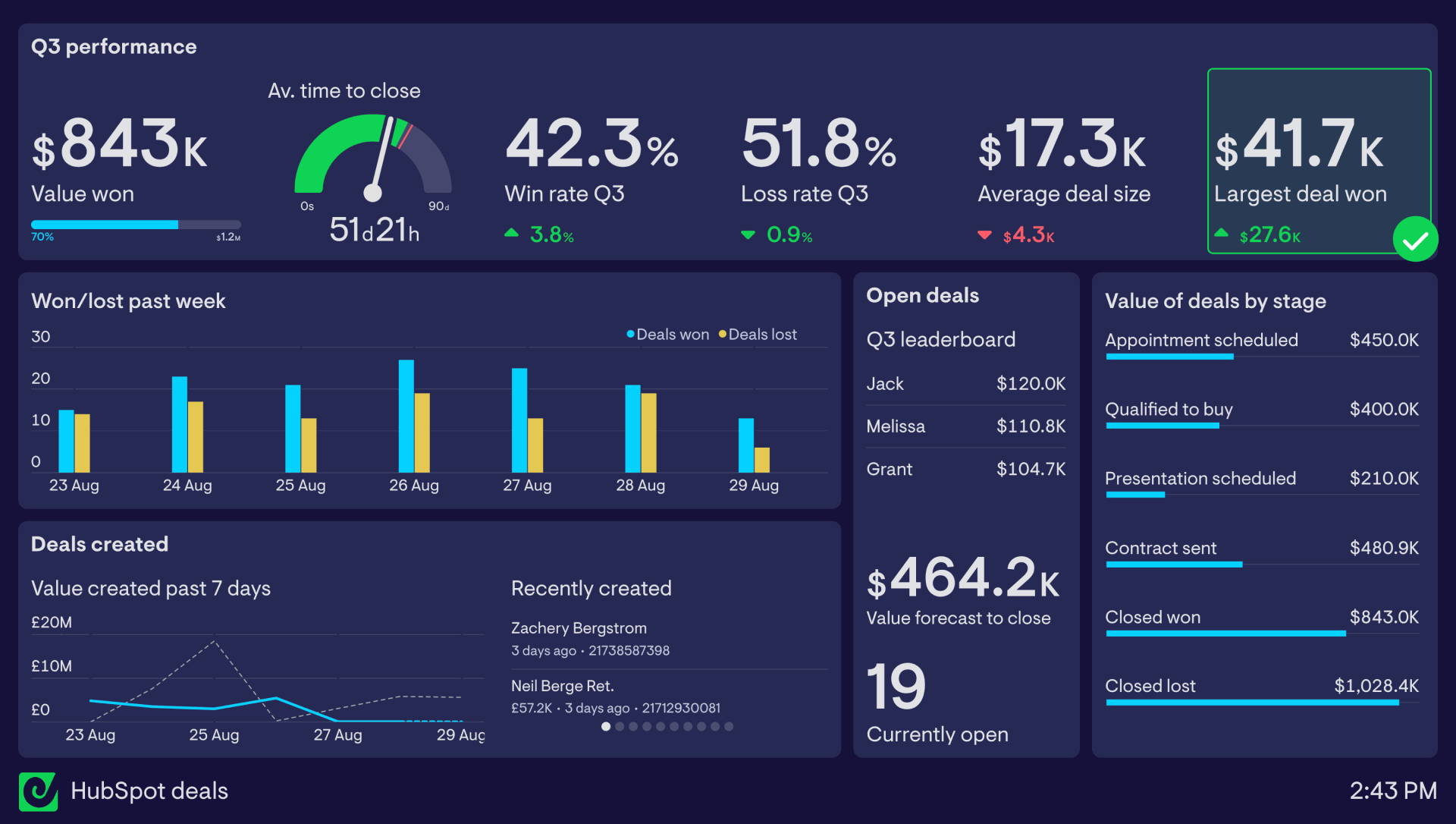
This dashboard is focused around important deal metrics and other useful information that can give a team a quick insight into how deals are progressing.
Along the top row is a series of performance data relating to how the team is performing over the quarter. KPIs like win rate, loss rate, average time to close, average deal size and largest deal won give the team a quick understanding of how they’re performing relative to the previous quarter. Placing their main goal in the top left of the dashboard - winning $1.2 million in value - is great dashboard design best practice.
In this case, ‘Largest deal won’ has been set up with a status indicator to alert the team when the largest deal of the quarter exceeds $40k - a great motivation booster.
Elsewhere on the dashboard, on the left are several charts showing how the week is progressing in real-time in terms of deals won and lost, and the value of deals created through the week. This line chart also includes a comparison with the previous 7 days, which can easily be toggled on or off.
To give everyone some more context, a feed of newly created deals sits to the right.
Rounding out the dashboard, a group of ‘Open deals’ widgets shows how many deals are currently open, the total weighted value of those forecast to close this quarter, and a live leaderboard of who in the team currently owns deals worth the most value.
Finally, the value of deals currently at each stage sits to the right, giving a useful snapshot of the health of the team’s pipeline.
If you’re looking to use dashboards to motivate reps, this guide on sales gamification explains what works (fast feedback loops) and what doesn’t (gimmicks).
HubSpot activity dashboard
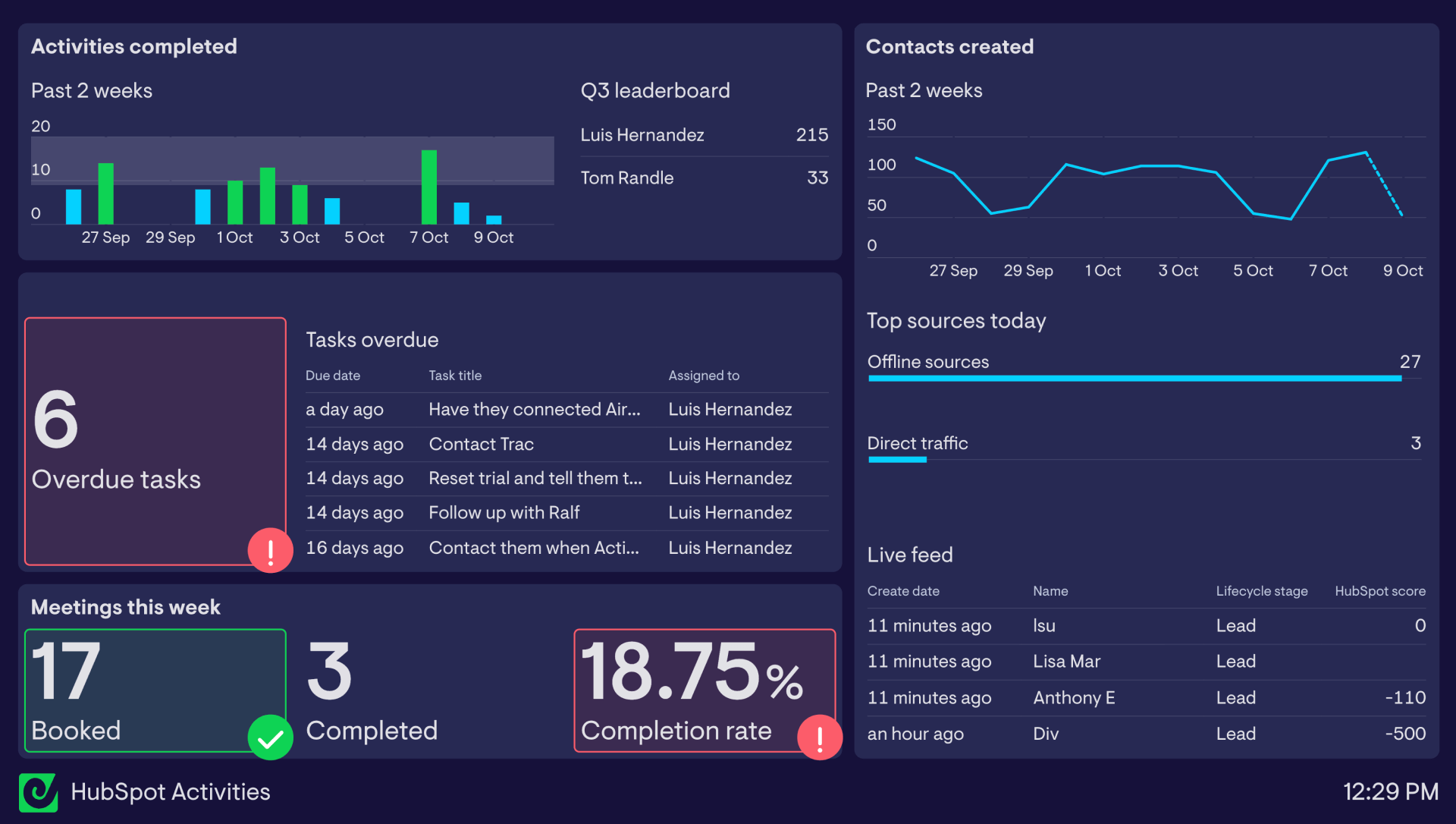
This dashboard focuses on activities being tracked within HubSpot, to keep the team sharp and aware of where they need to focus their efforts.
In the top left of the dashboard is a high-level overview of how many tasks the team has completed day-by-day over the past two weeks. For an extra motivation boost, this visualization has a goal set up to highlight in green when they've completed 8 or more tasks in a day, and to the right is a leaderboard showing who's completed the most tasks this quarter.
Below this, the team is tracking how many tasks are marked overdue. A list of overdue tasks sits to the right with the total number of overdue tasks set to highlight red and notify the team in Slack when there are more than 5 tasks overdue.
At the bottom are some metrics specifically related to meetings that the team are interested in monitoring - meetings booked, meetings completed, and the meeting completion rate.
The second half of the dashboard is devoted to outcomes. For this team, logging new contacts as leads is the aim of the game, and the line chart to the top right allows them to quickly see if they're on track with expectations, along with some extra information on where today's leads came from.
The dashboard is completed by a live feed of new leads being logged, giving everyone more visibility of any interesting potential deals entering the pipeline.
Browse other popular examples
A HubSpot dashboard pulls deal, contact, and activity data from HubSpot into a live display that sales teams can monitor in real time. It gives sales managers a current view of pipeline health and rep activity — without everyone needing to log into HubSpot to check progress.
Geckoboard is a live dashboard tool that connects to HubSpot alongside Salesforce, Google Analytics and more to give sales teams a shareable, always-current view of performance. It's built for teams who want their key metrics on a TV screen, shared link, or automated daily snapshot — without navigating multiple platforms each time.
Typical metrics include deals created, deals closed, pipeline value by stage, close rate, new contacts, email activity, and calls logged. Teams tracking monthly targets compare these against goals set at the start of the period.
Building a custom HubSpot dashboard is straightforward with Geckoboard's dashboard builder. Connect HubSpot to pull deals, contacts, and activity data directly into Geckoboard, then pick your metrics and build the view you need. Share with your team as a TV dashboard, shared link, or scheduled snapshot. Start a free trial or learn more about how Geckoboard works.
Use it to monitor performance in real time — so sales managers always know where the pipeline stands without asking reps for updates. It also helps automate reporting by replacing the end-of-week sales summary email with a live HubSpot dashboard anyone can check at any time.