Improvements to tables and tooltips
Making data easy to understand is a core part of Geckoboard’s mission. We took some time recently to improve the way some of our visualizations behave in order to improve legibility and bring them in line with current best practice.
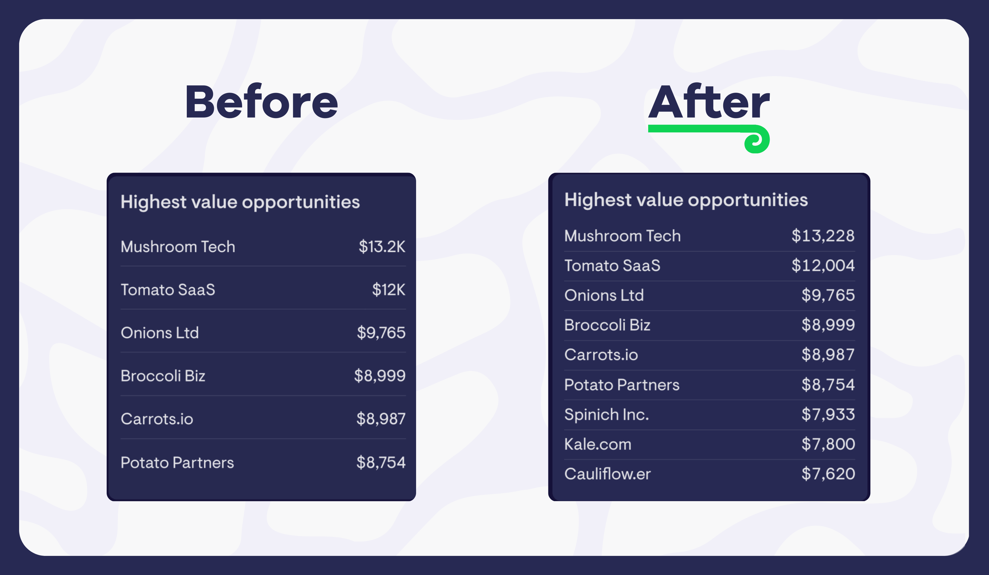
Improved alignment of numbers in a table
Previously, numbers in a table would use proportional spacing, often resulting in them being misaligned. Now numbers align cleanly, making it easier to compare values across different rows in a glance.
Consistent number formatting
Another behavior that previously made tables trickier to read was the use of inconsistent formatting across numbers in a column. This has now been fixed to ensure all numbers share the same abbreviation and number of decimal places.
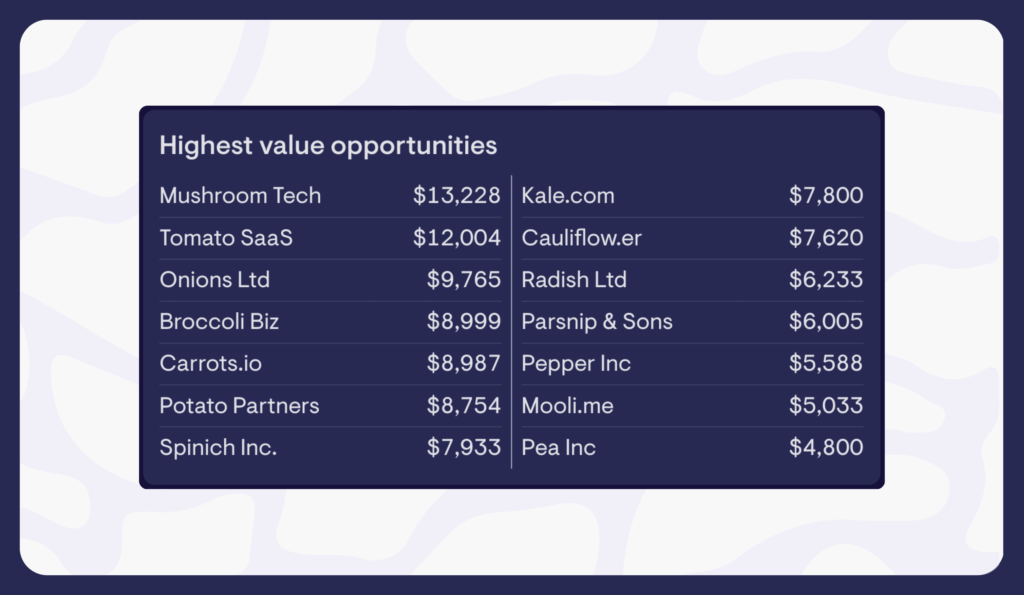
Column wrapping on tables
We’ve made tables more flexible, to make better use of the space on your dashboards. If your dataset is longer than your widget would normally have allowed, and there’s unused space in your widget, your table will now wrap to show a second column of data.
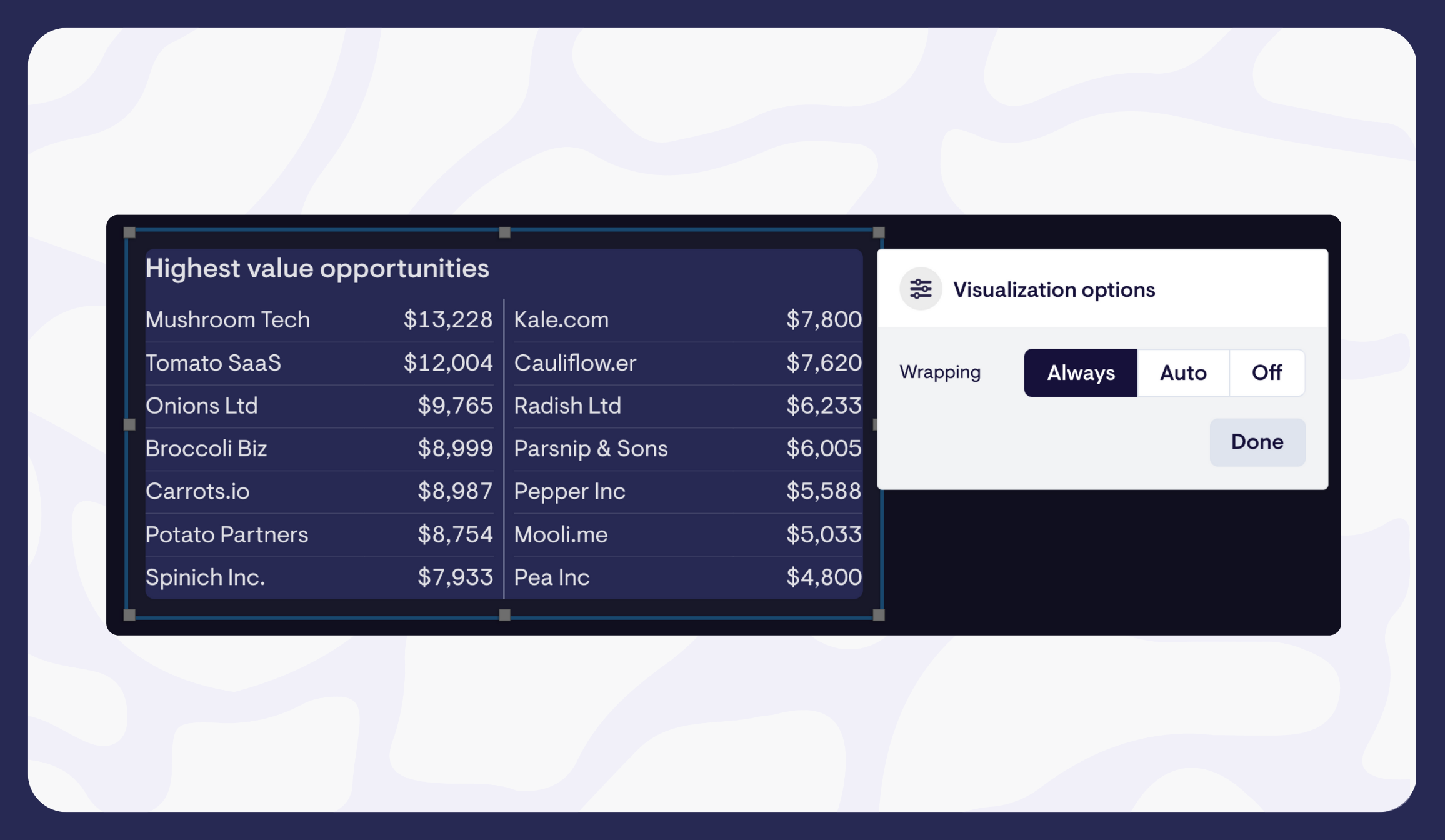
Newly created tables wrap by default, but you can change this behavior using a new ‘Visualization options’ menu.
Better tooltips
On line and column charts, you’ll now notice tooltips include the name of the series, and there’s less chance of them overlapping with the data point you’re looking at too!
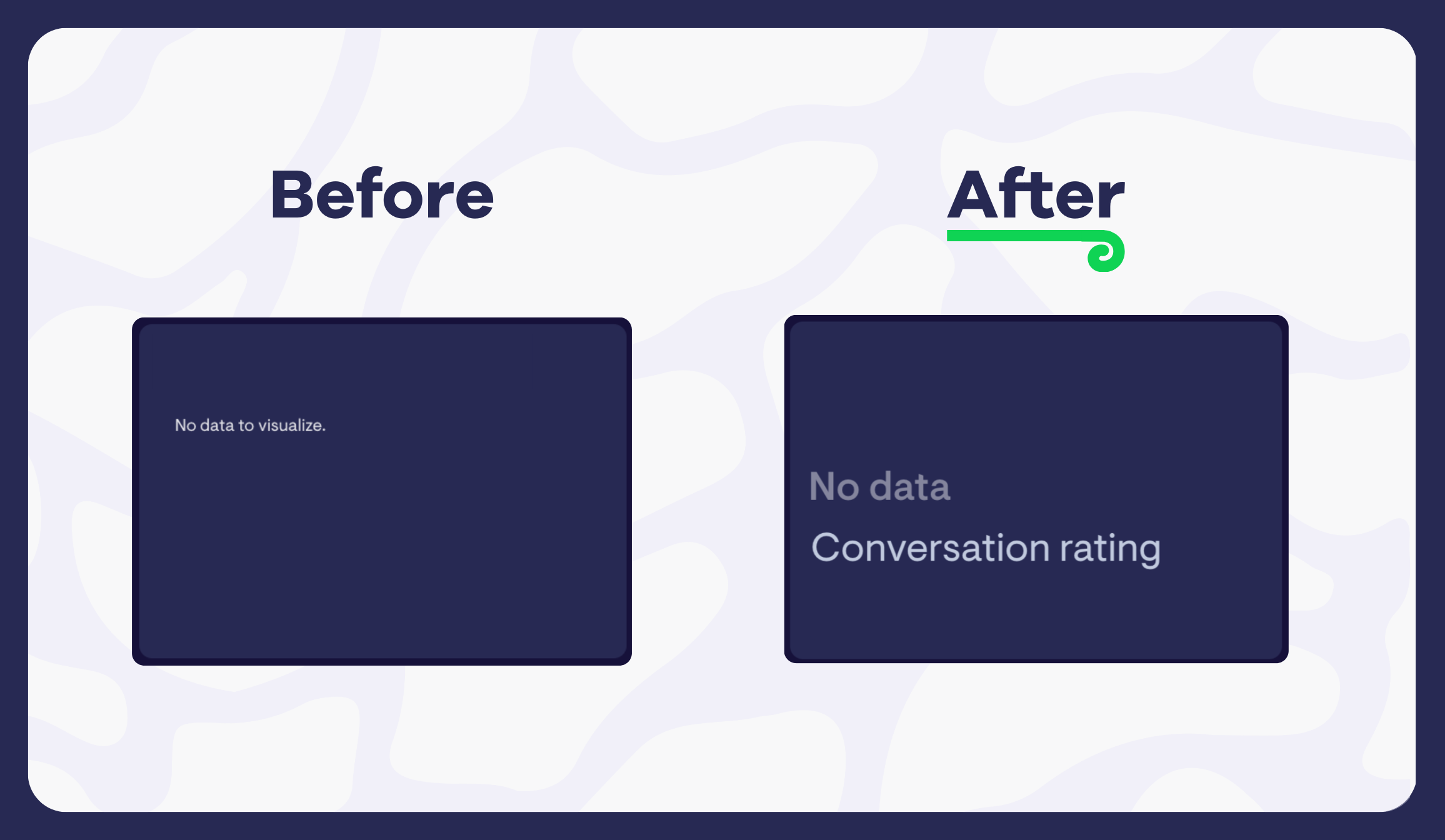
Improved handling of ‘no data’ situations
Number widgets now clearly show when there’s no data available to create a visualization, and no longer hide labels either.